Have a look on my recent case study developed during the digital bootcamp by ironhack.
Case study
Redesign VAHA
![]()
Case study
Sleep tracking app Snoozy
A Million Hellos! Best regards, Max (a million) – UX/UI Designer
Have a look on my recent case study developed during the digital bootcamp by ironhack.
Redesign VAHA
![]()
Sleep tracking app Snoozy
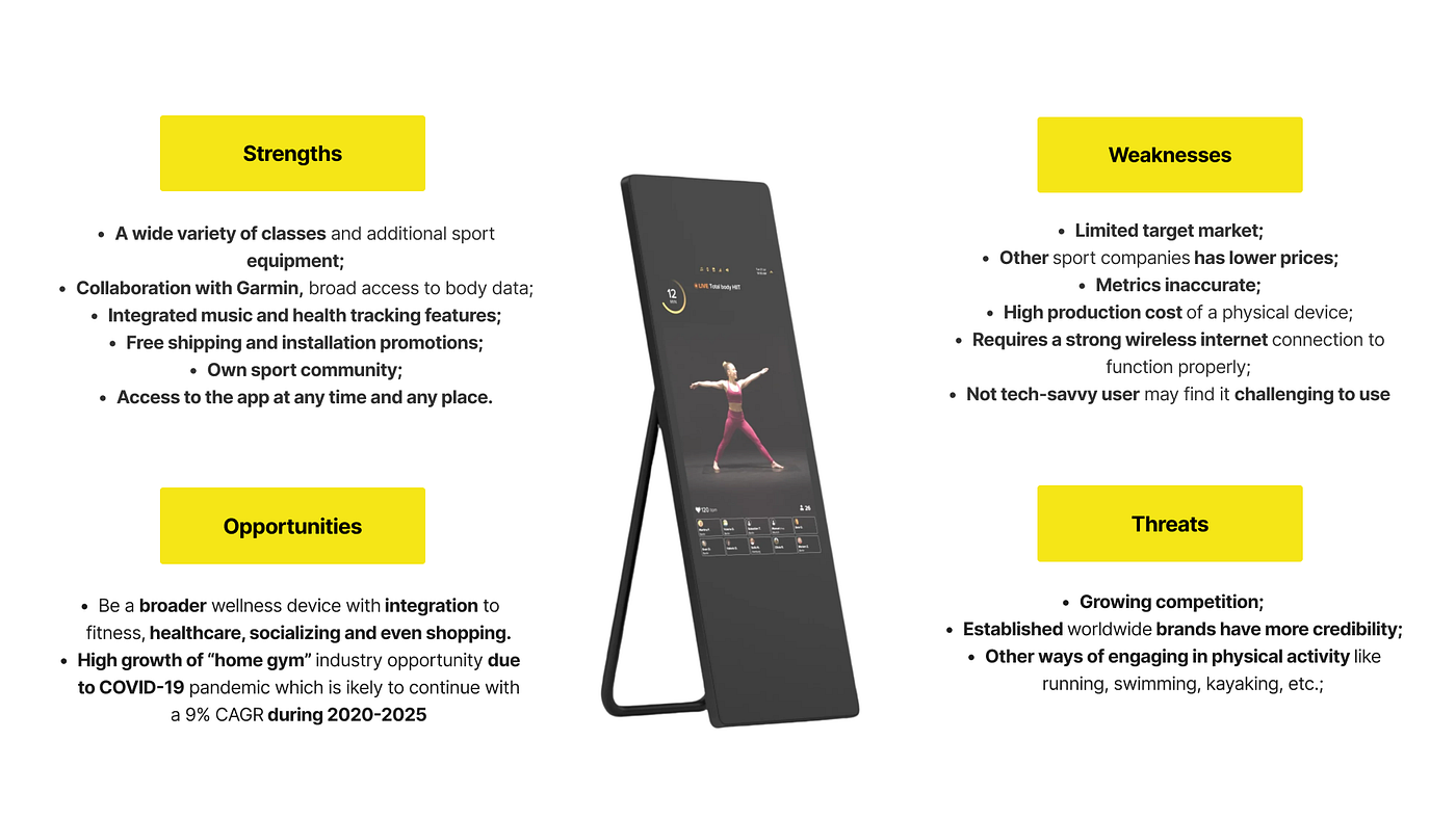
VAHA is selling fitness mirrors with touchscreens and workout subscriptions. This product is new to the german market, so they are still taking care of their brand awarness.
The demografic target group are people between 35 and 50 years with a good income.
First we took a look at the user journey map the customer is doing right now. The state of art website can be confusing for the user because there is to much content at different places and we also detected an interrruption at the checkout process.
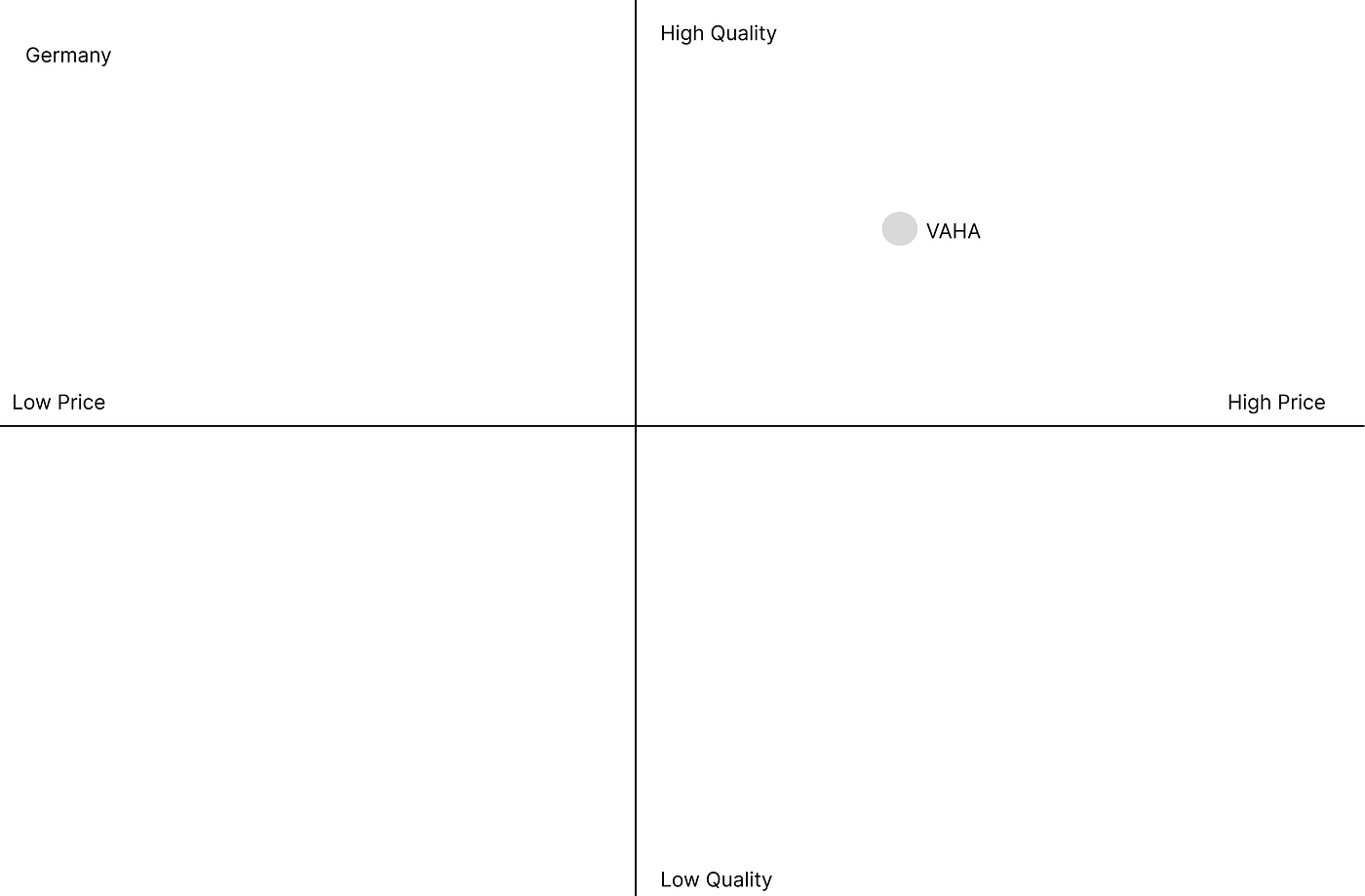
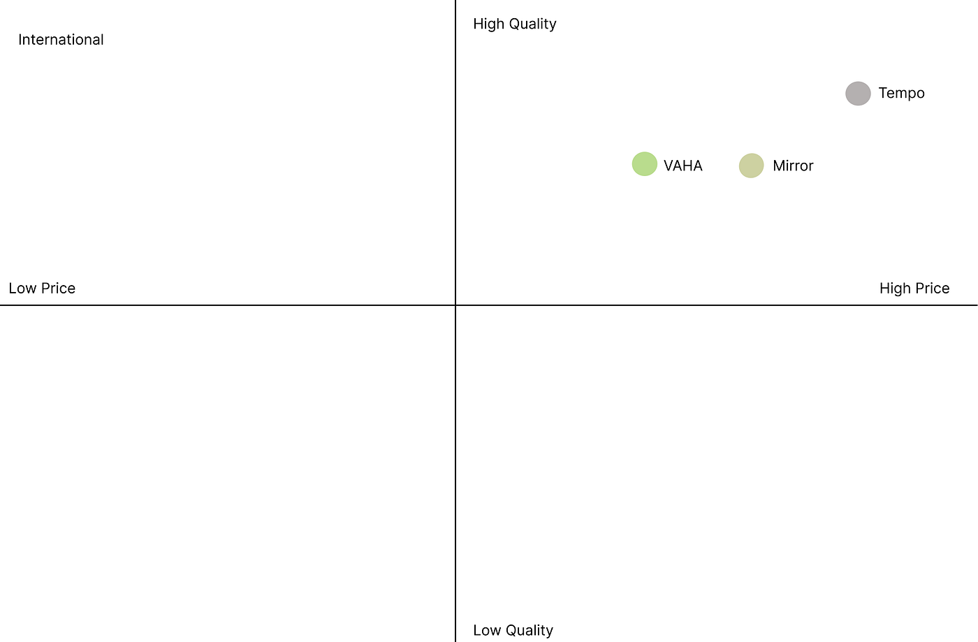
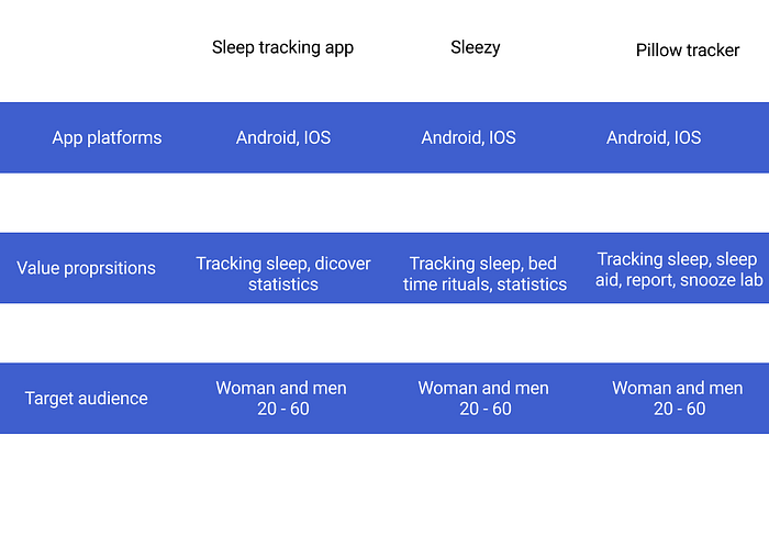
So we started with competive analysis and the SWOT to get to know more about our customer and its positoning in the market by comparing with competitors.
Price and quality (Germany):
Price and quality (International)
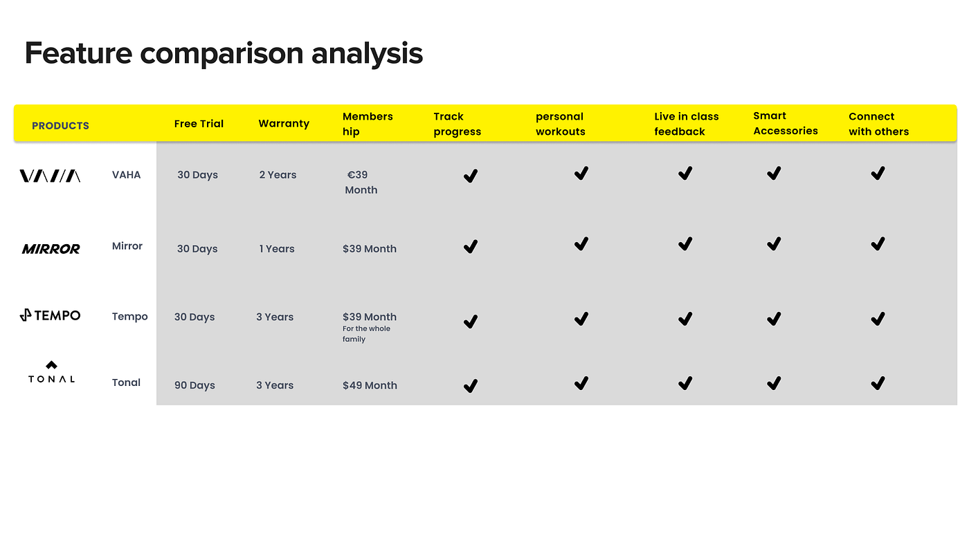
We also compared the features of VAHA and the competitors.
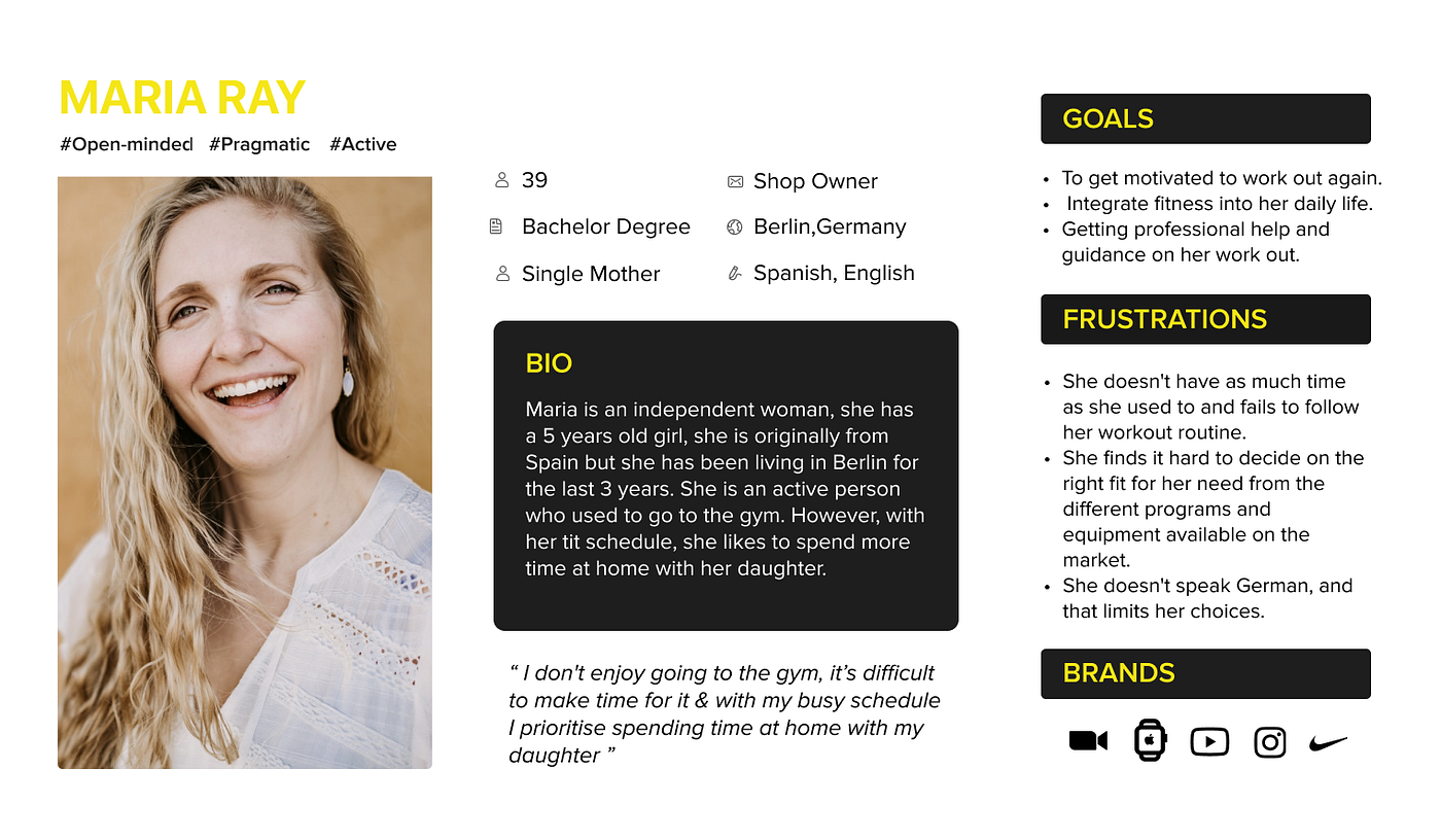
In the next step we created our user persona Maria Ray.
She is an 39 year old mother from spain, living in Berlin for 3 years and is active and liked going to the gym.
But she has her own shop and she would like to spend more time at home with her daughter.
Her goals are getting motivated for work outs again, to integrate fitness in her daily life
and getting professional help and guidance for her work out.
But she is frustrated, because she doesn`t have as much time as she used to on it and fails to follow her workout routine.
And she finds it difficult to find the right course and there is also the language barrier, because she doesn`t speak german.
So we interviewed the stakeholder, 3 potential users and one user about their backgroung, their sport motivation and if they are using fitness apps.
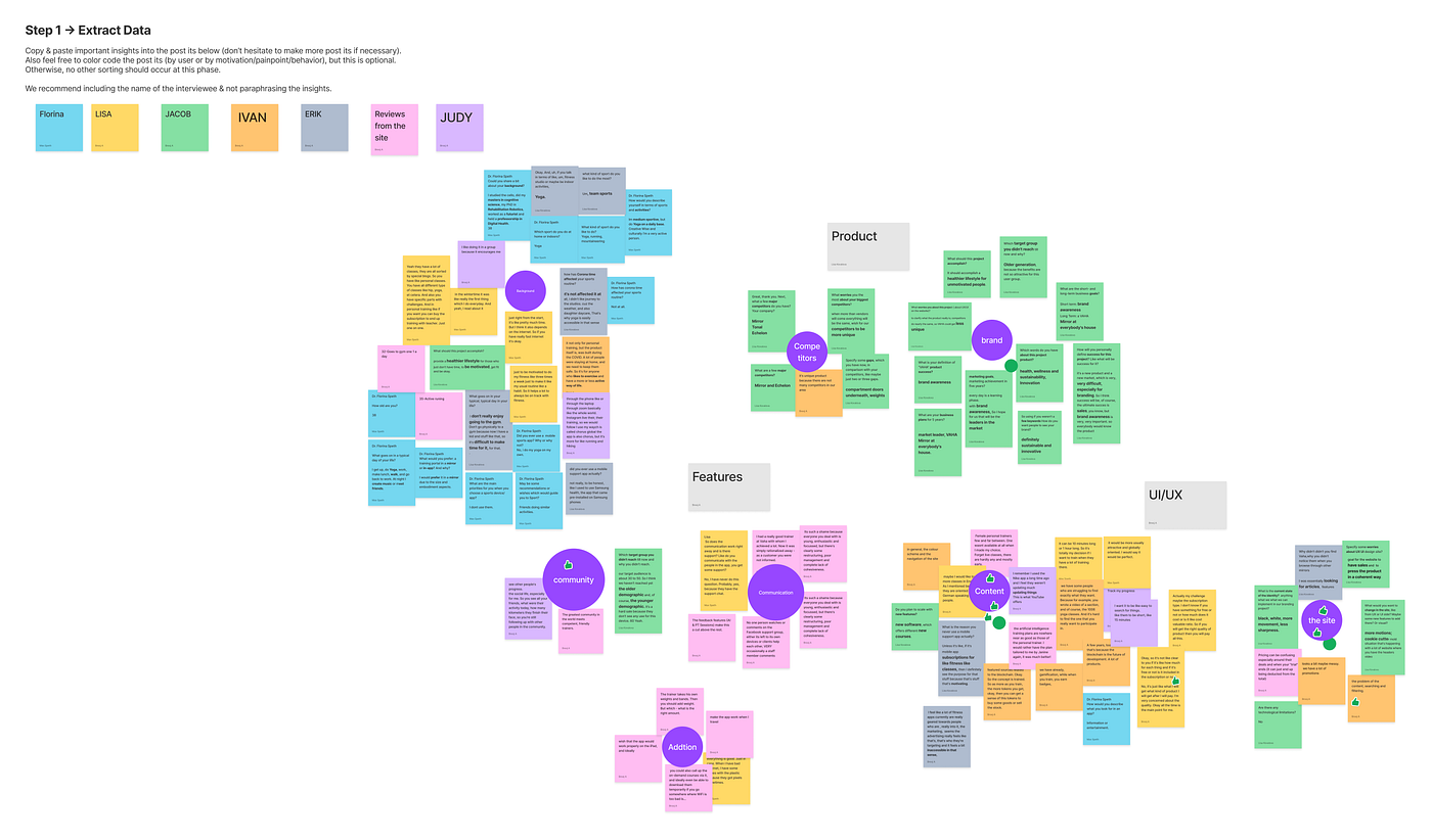
By extracting the data of this interviews we detcted 7 Clusters in our affinity diagramm:
Content
the site
brand
competitors
communication
community
addition
So we decided via dot voting to work on the clusters “Conent” and “the site” and worked on our problem statement.
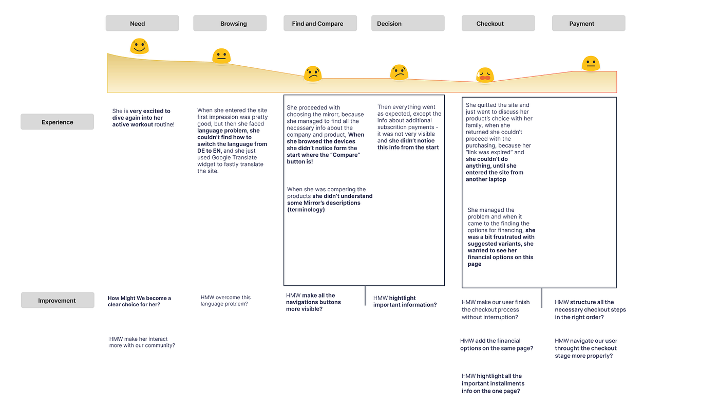
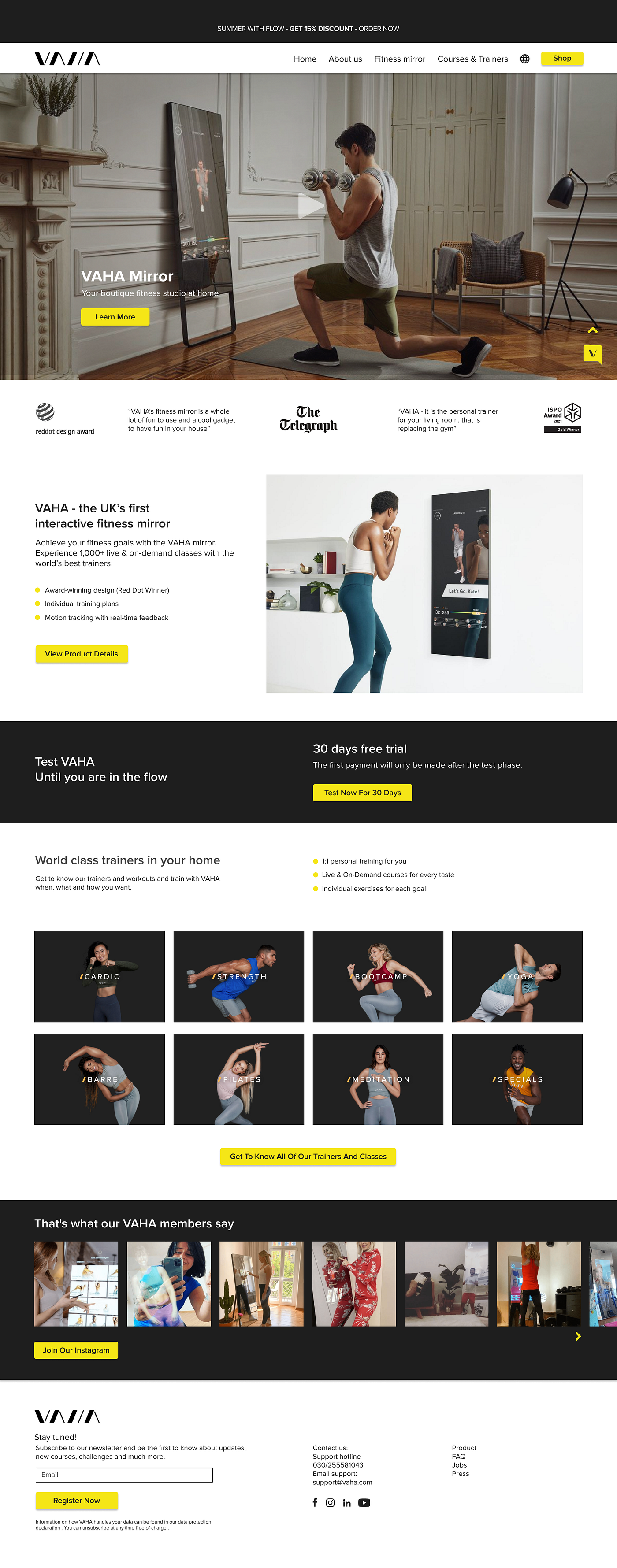
The VAHA website was designed to sell interactive fitness mirrors. We have observed that the client’s experience of buying from the site was not smooth and interrupted at the checkout, which is affecting sales, so the company is losing customers.
Taking a view on the user journey map
User journey map
Sitemap:
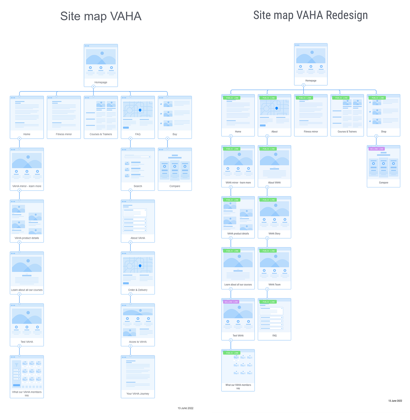
The sitemap has in inconsistant structure and needs to be fixed so we designed a new sitemap.
state of art sitemap
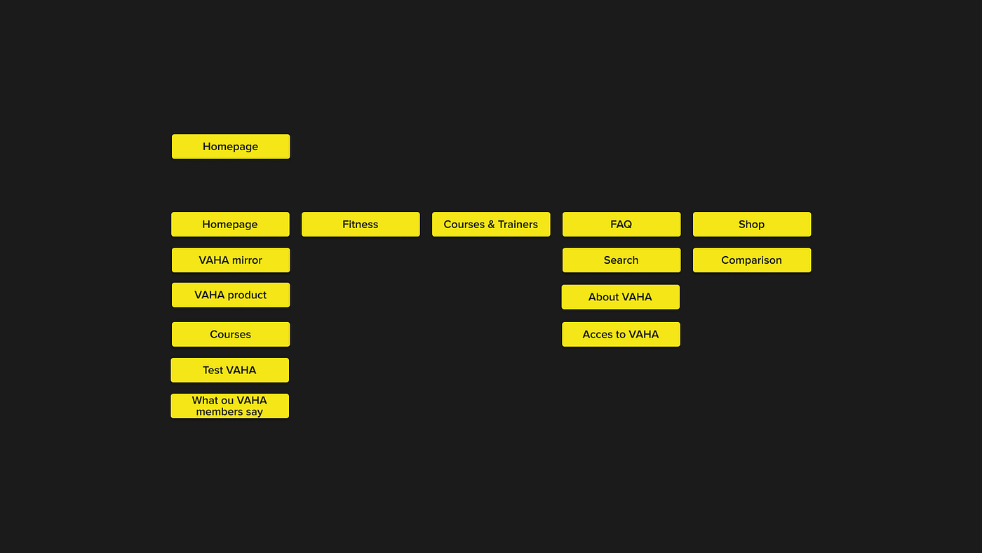
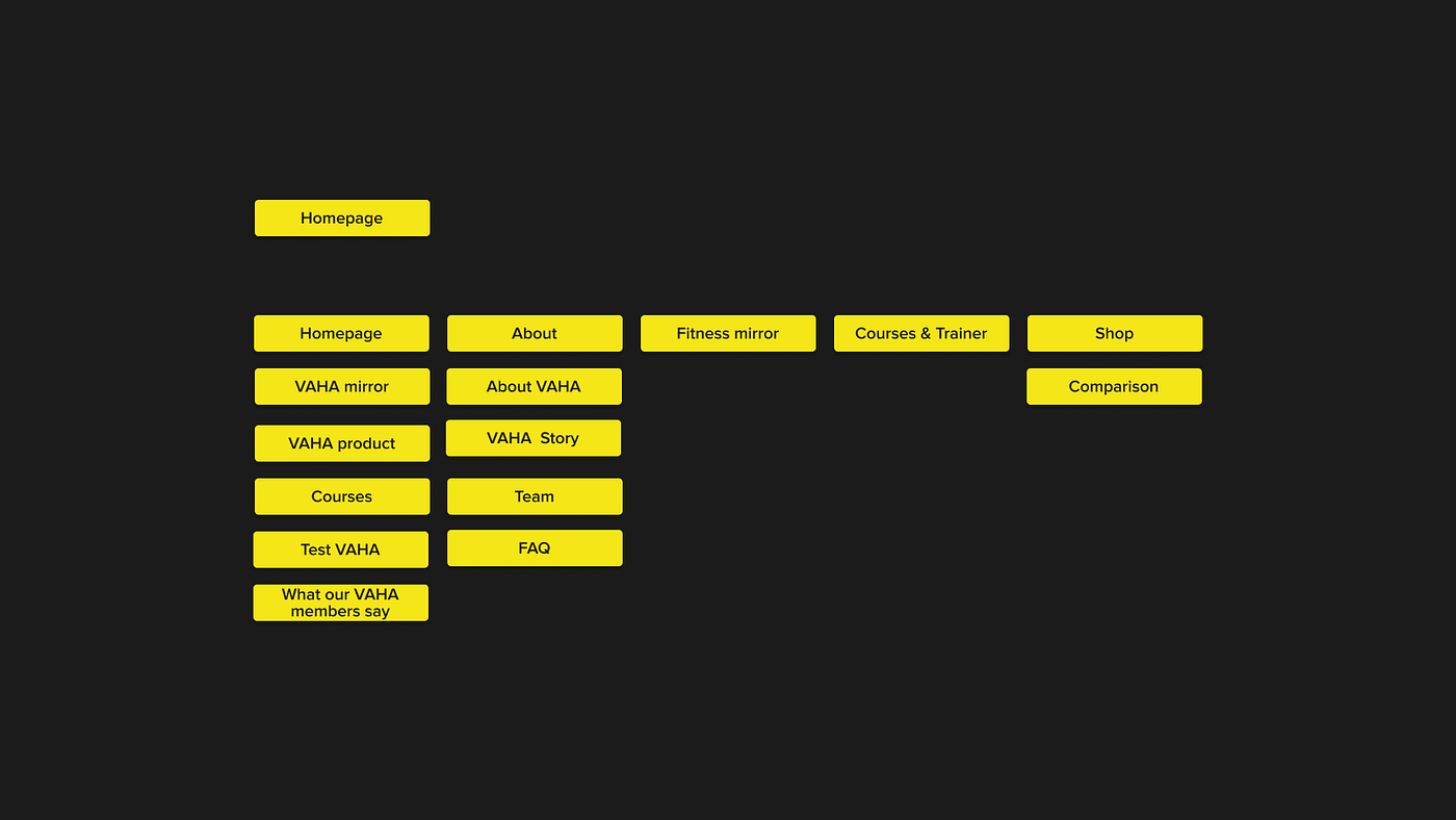
Because users might not intend the content “About VAHA” and Access to “Vaha” by FAQ,
we added “About” to the main navigation, where you can find the “FAQs “ icluded.
We also added “About VAHA”, “VAHA Story” and “Team”, so the user can find all informations about VAHA in a short and consistant way.
In the nest step we viewed the user flow the user is taking now.
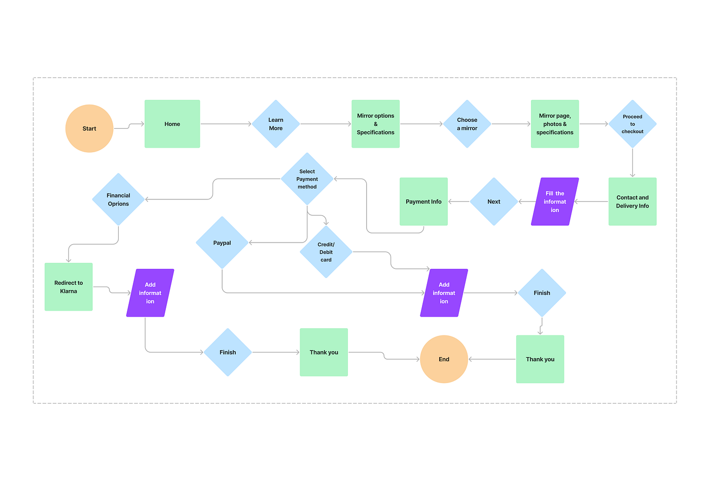
The flow is taking a simple and consistent way now.
Starting with the homepage you get to mirrors and options,
where you have to make a decision for the model and you proceed to checkout.
Here the customer information needs to be filled and the user reaches the payment infos.
So he needs to choose between Klarna, Paypal or credit/ debit card,
so he reaches the Thank you page and gets to the end.
Low fidelity wireframes:
After validating this first step, we went to mid fidelity wireframes:
In the next step we worked with our brand attribute developing a mood board, to concrete the brand we will develop, after defining 5 adjectives that fit to our clients desires.
Adjectives:
Motivating
Innovative
Elegant
Joyfull
Convinient
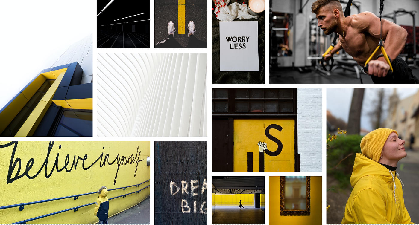
To make sure, our choose is taking the right way we tested this moodboard on usabilty hub.
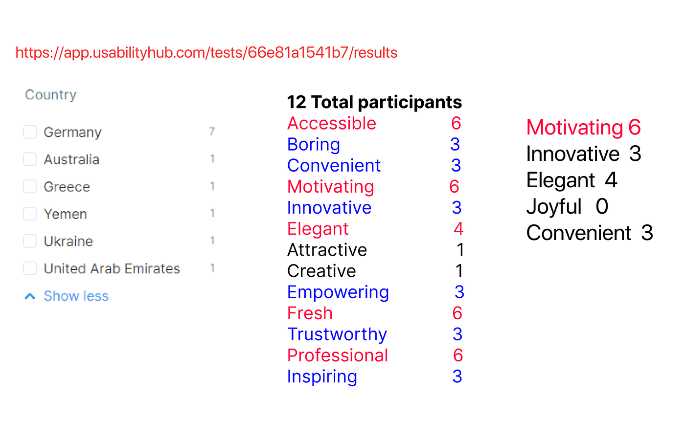
The results were matching, but didn`t fit to the adjective joyful, so we were thinking about dropping this adjective of our mood board.
Our stakeholder gave their brand book to us, so we decided to keep the colors, as they are also matching to our moodboard.
Proxima Nova is the chosen typeface because it works very well with different devices.
With these brand attributes we started to work on our high fidelity prototype after we decided which fontface and colors will be used there.
Prasentation:
project page
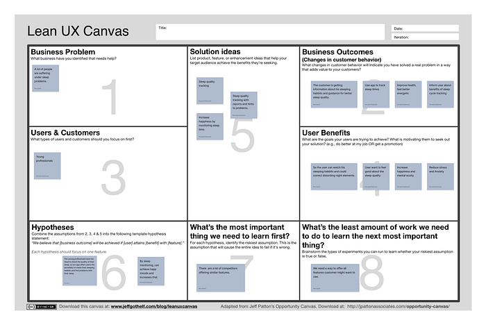
Lean UX Canvas
Afinity diagram
Empathy map
Problem Statement
HMW
User persona sleepy Sandra
Sandras journey map
MVP
Lo Fi Wireframes and concept testing
Mi Fi Wireframes and usability testing
Moodboard
Style Tile
Hi Fi Wireframes
We will do quality interviews and quantity interviews, so we started to do our Lean Survey Canvas.
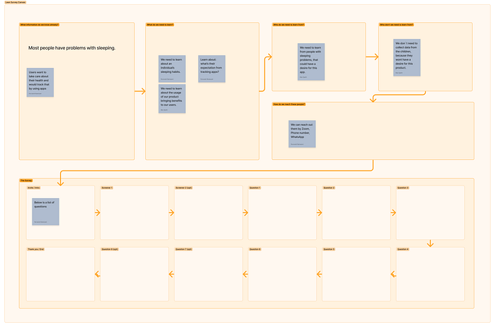
So we generated our survey for the quantity method with google forms:
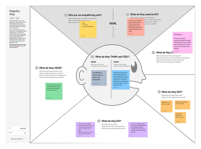
In the next step we created an empathy map to take a deep view who we are empathysing with.
We will do quality interviews and quantity interviews, so we started to do our Lean Survey Canvas.
After our quality interviews this morning we will start with an affinity diagram.
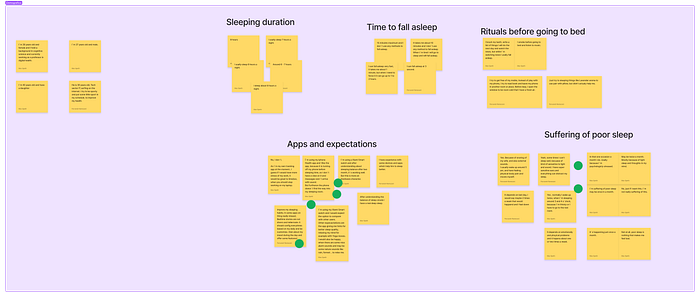
We detected following 5 Clusters in our affinity diagramm:
Apps and expectations
Suffering of poor sleep
Time to fall asleep
Rituals before going to bed
Sleping duration
So we decided to work on the cluster Apps and expectation.
In the next step we created an empathy map to take a deep view who we are empathysing with.
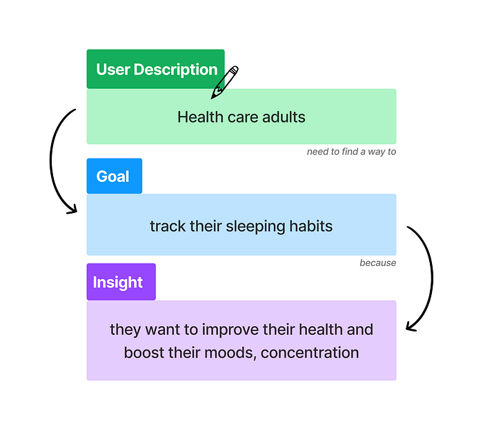
Followed by our problem statement:
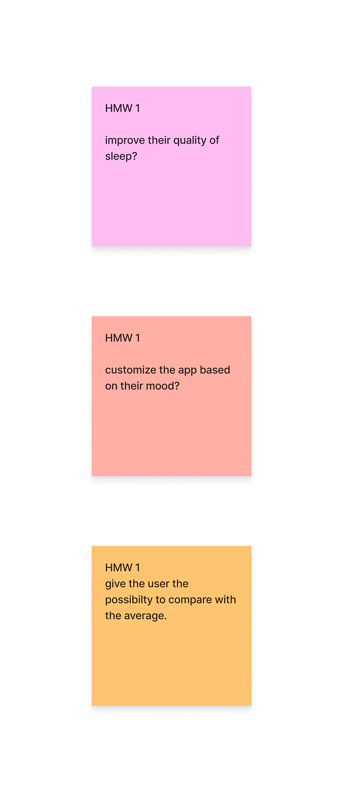
So went on to work on the HMW:
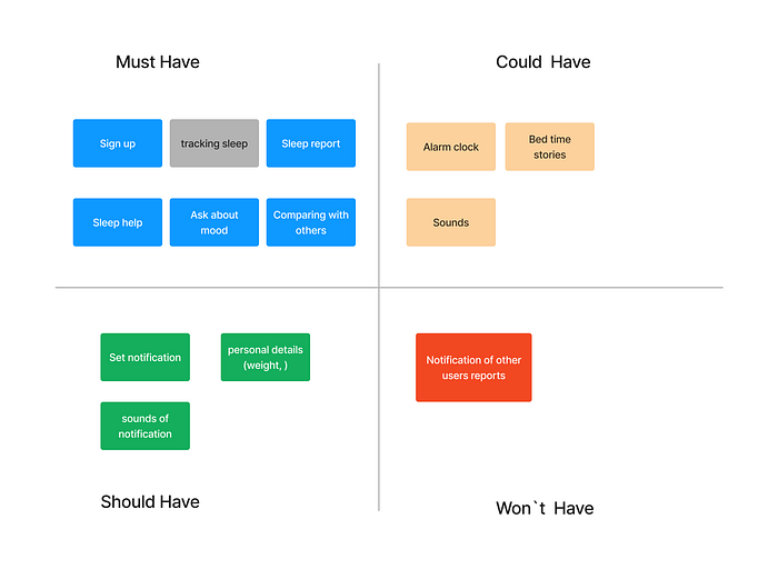
After this we were taking a look at our app with the MOSCOW method to develop our MVP:
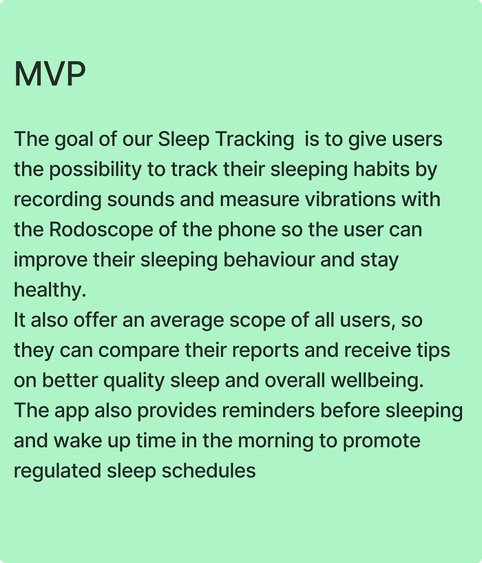
So we developed our MVP with following two paragraphs:
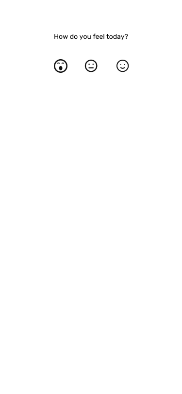
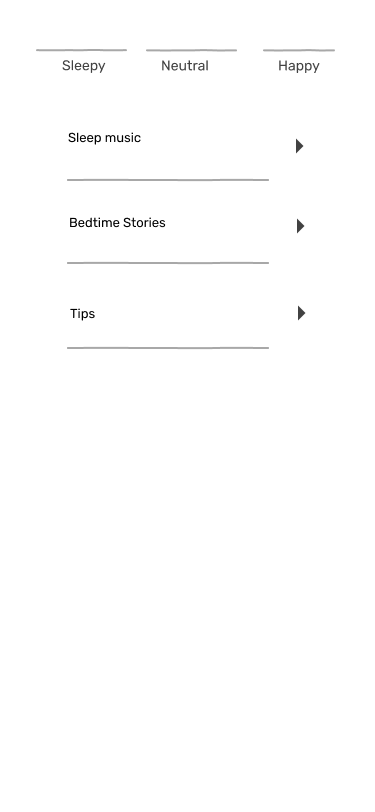
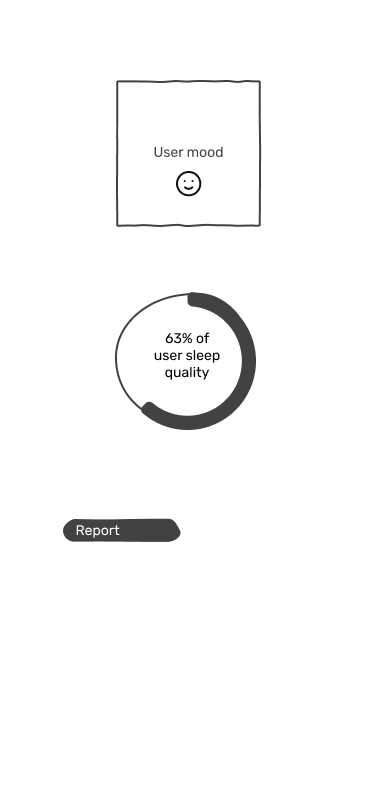
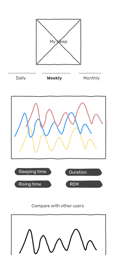
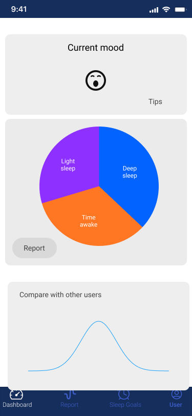
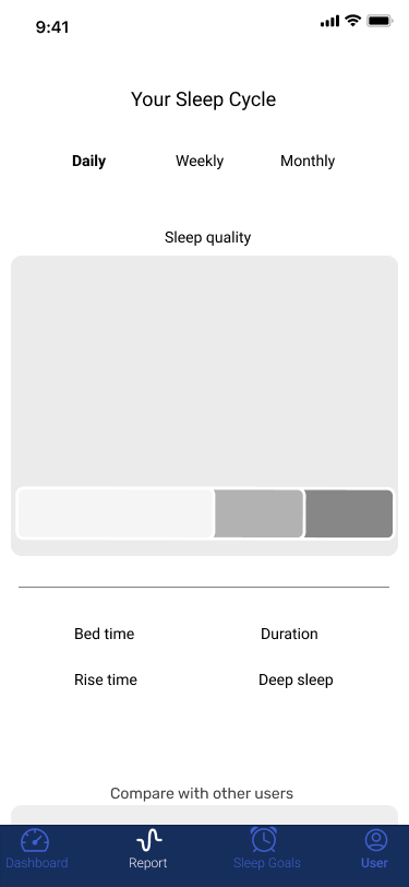
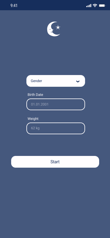
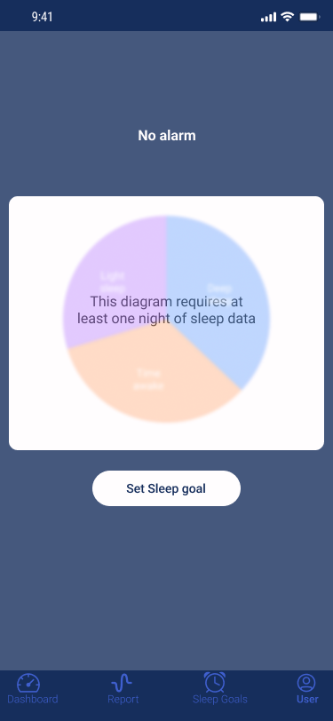
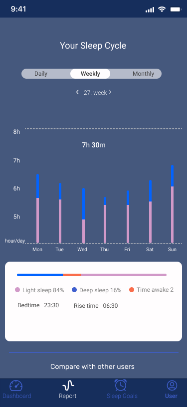
The goal of our app (Sleep tracking) is to help users to improve their sleeping habits and keep healthy by tracking their quality of sleep with setting a sleep goal during the weekdays. And also, by displaying a line chart, user can compare his/her quality of sleeps with other users to find out where they are on average. Lastly, the app also provides short & practical tips for users to improve their sleep.
The goal of our Sleep Tracking is to give users the possibility to track their sleeping habits by recording sounds and measure vibrations with the Rodoscope of the phone so the user can improve their sleeping behaviour and stay healthy.
It should also offer an average scope of all users, so you have the possibility to compare your report and it should give hints for a better sleeping quality for the mood of the user.
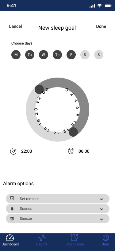
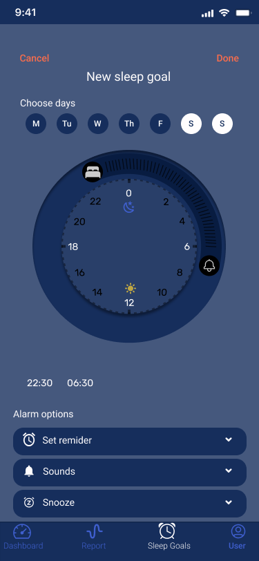
The app should also remind the user before sleeping time and wake him up in the morning.
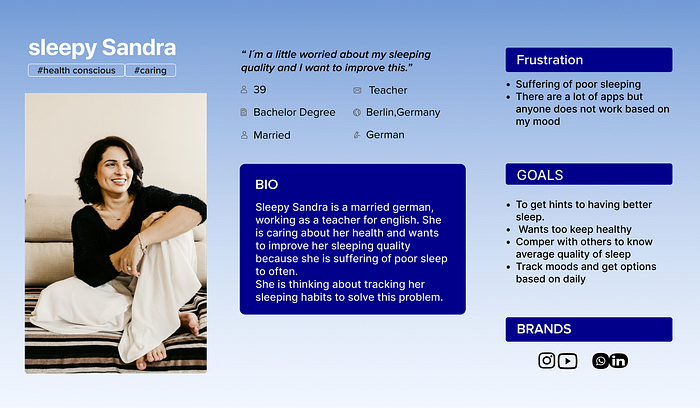
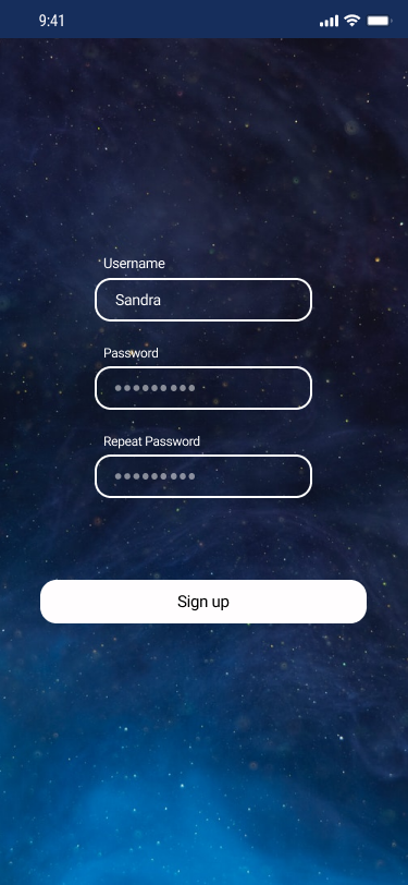
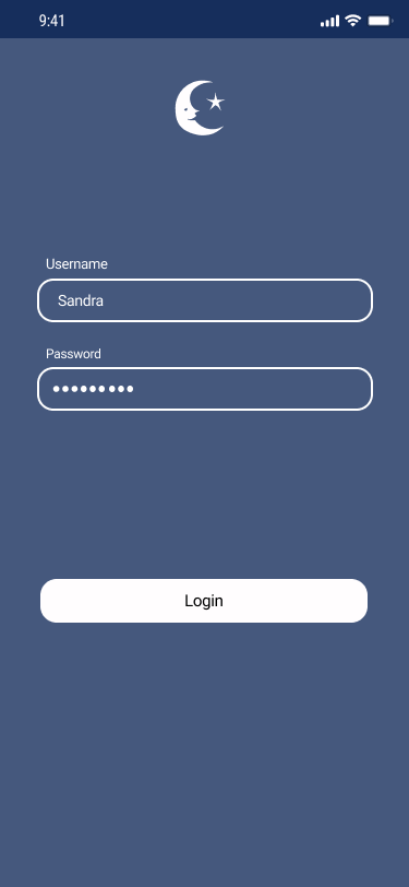
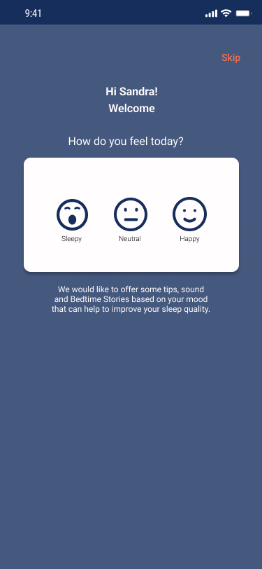
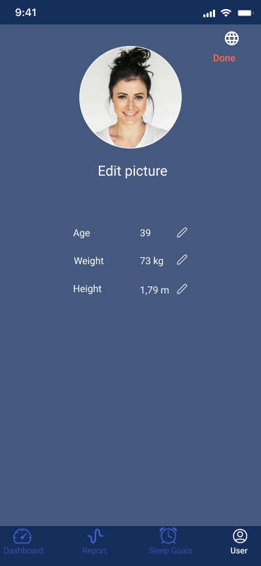
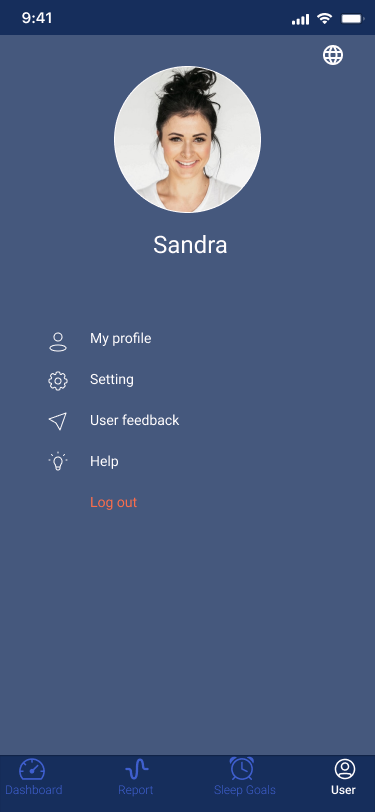
We were building our user persona sleepy Sandra:
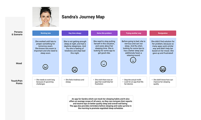
with her user journey map:
So we started to develop our Low Fidelity Wireframes:
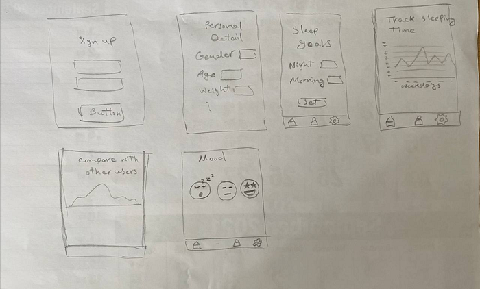
and went further on in figma with the first essential wireframes:
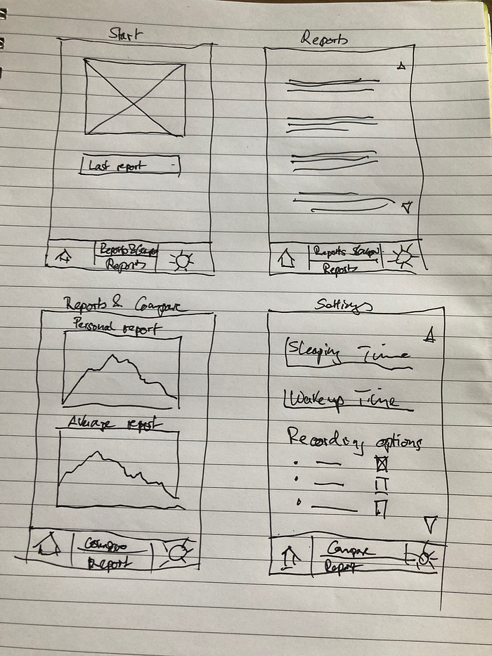
After concept testing and some changes like a dashboard screen for users, who are starting with the app without collected data, we developed our Mid Fidelity Prototype:
Moodboard:
Colors:
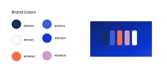
We decided to use the typeface Roboto, because it works well on mobile devices.

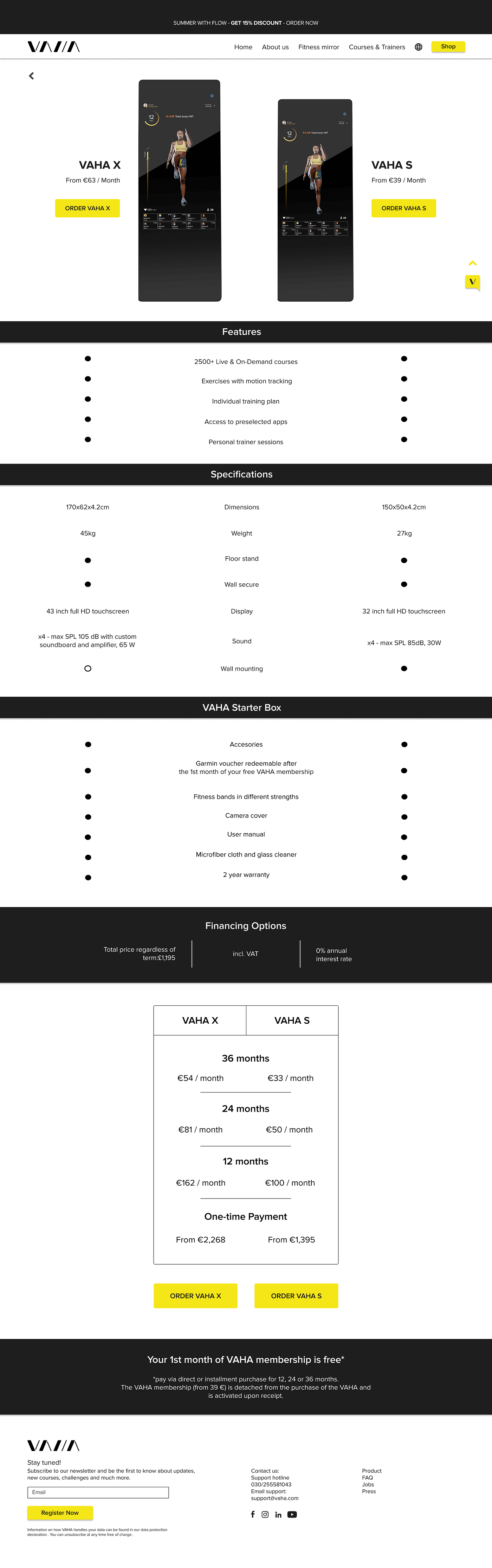
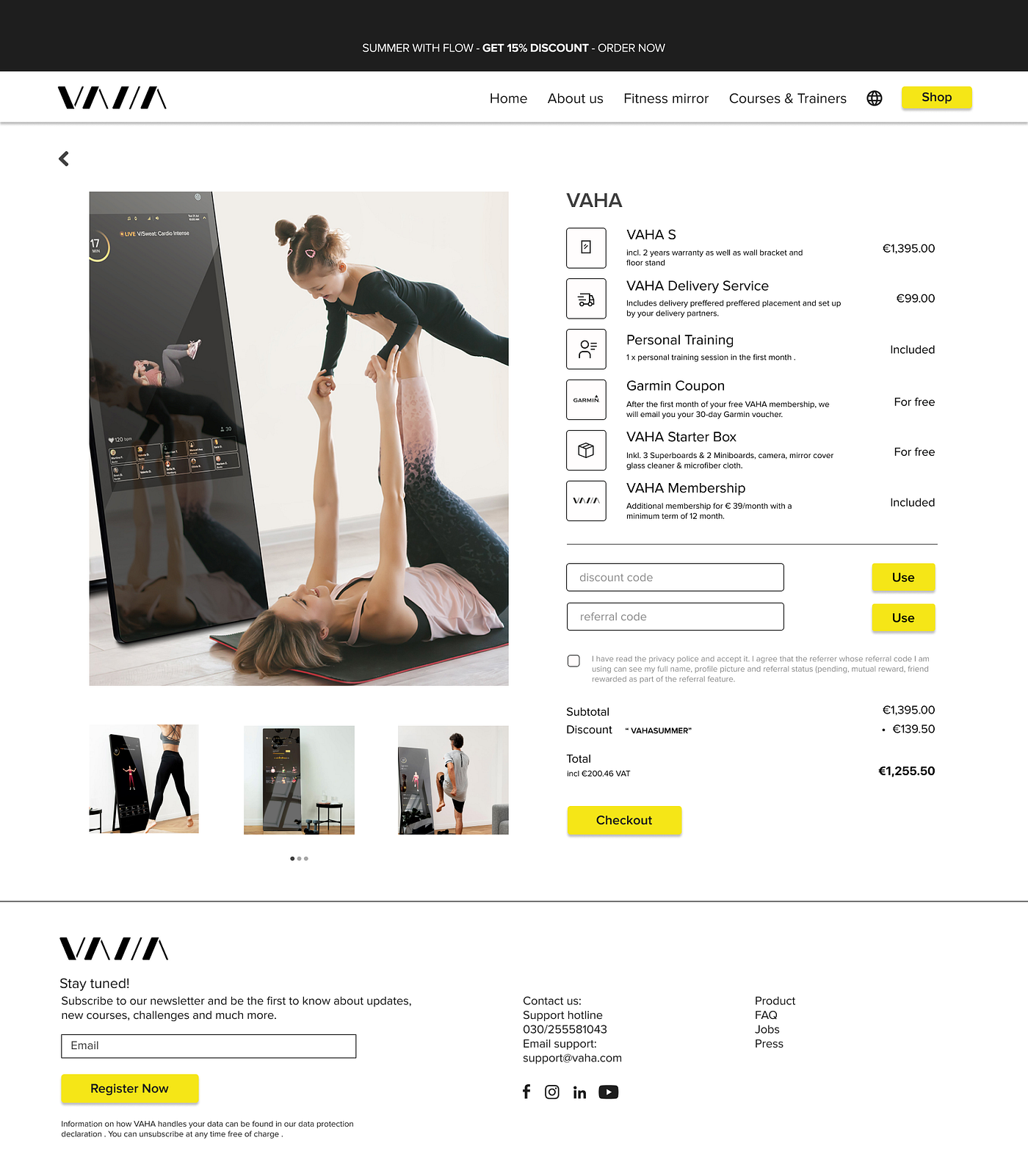
So we developed our solution:

VAHA is selling fitness mirrors with touchscreens and workout subscriptions. This product is new to the german market, so they are still taking care of their brand awarness.
The demografic target group are people between 35 and 50 years with a good income.
First we took a look at the user journey map the customer is doing right now. The state of art website can be confusing for the user because there is to much content at different places and we also detected an interrruption at the checkout process.
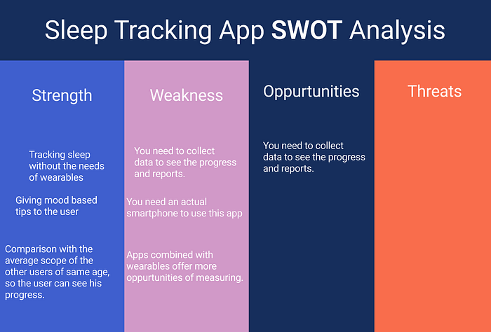
So we started with competive analysis and the SWOT to get to know more about our customer and its positoning in the market by comparing with competitors.
Price and quality (Germany):
Price and quality (International)
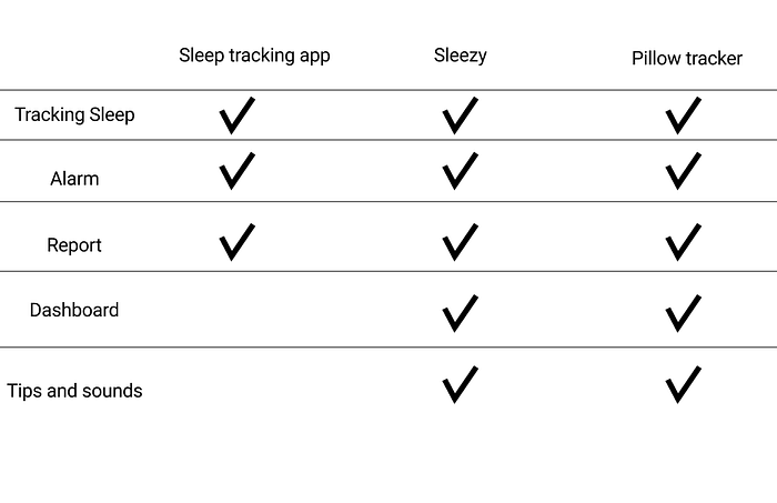
We also compared the features of VAHA and the competitors.
In the next step we created our user persona Maria Ray.
She is an 39 year old mother from spain, living in Berlin for 3 years and is active and liked going to the gym.
But she has her own shop and she would like to spend more time at home with her daughter.
Her goals are getting motivated for work outs again, to integrate fitness in her daily life
and getting professional help and guidance for her work out.
But she is frustrated, because she doesn`t have as much time as she used to on it and fails to follow her workout routine.
And she finds it difficult to find the right course and there is also the language barrier, because she doesn`t speak german.
So we interviewed the stakeholder, 3 potential users and one user about their backgroung, their sport motivation and if they are using fitness apps.
By extracting the data of this interviews we detcted 7 Clusters in our affinity diagramm:
Content
the site
brand
competitors
communication
community
addition
So we decided via dot voting to work on the clusters “Conent” and “the site” and worked on our problem statement.
The VAHA website was designed to sell interactive fitness mirrors. We have observed that the client’s experience of buying from the site was not smooth and interrupted at the checkout, which is affecting sales, so the company is losing customers.
Taking a view on the user journey map
User journey map
Sitemap:
The sitemap has in inconsistant structure and needs to be fixed so we designed a new sitemap.
state of art sitemap
Because users might not intend the content “About VAHA” and Access to “Vaha” by FAQ,
we added “About” to the main navigation, where you can find the “FAQs “ icluded.
We also added “About VAHA”, “VAHA Story” and “Team”, so the user can find all informations about VAHA in a short and consistant way.
In the nest step we viewed the user flow the user is taking now.
The flow is taking a simple and consistent way now.
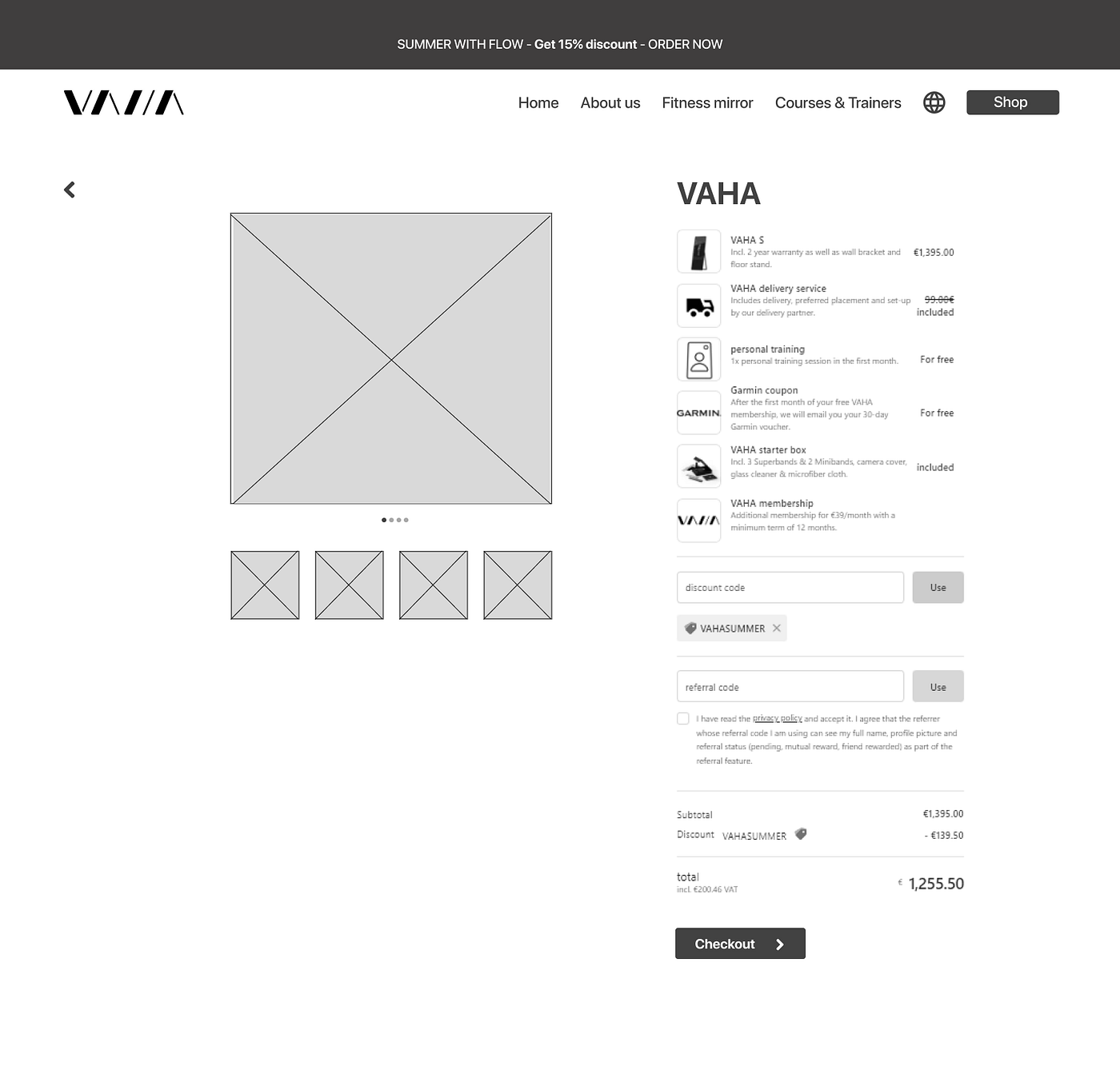
Starting with the homepage you get to mirrors and options,
where you have to make a decision for the model and you proceed to checkout.
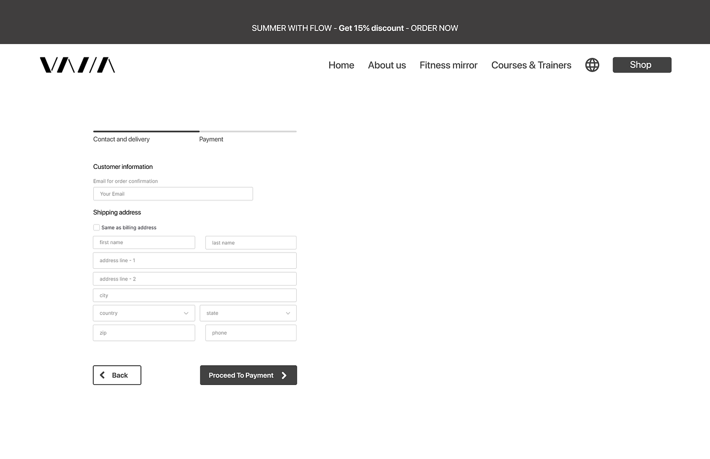
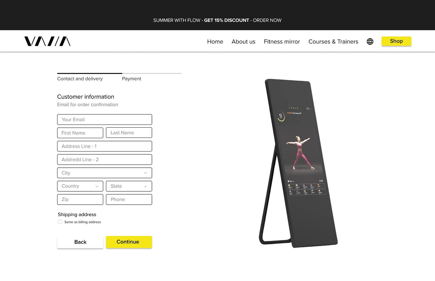
Here the customer information needs to be filled and the user reaches the payment infos.
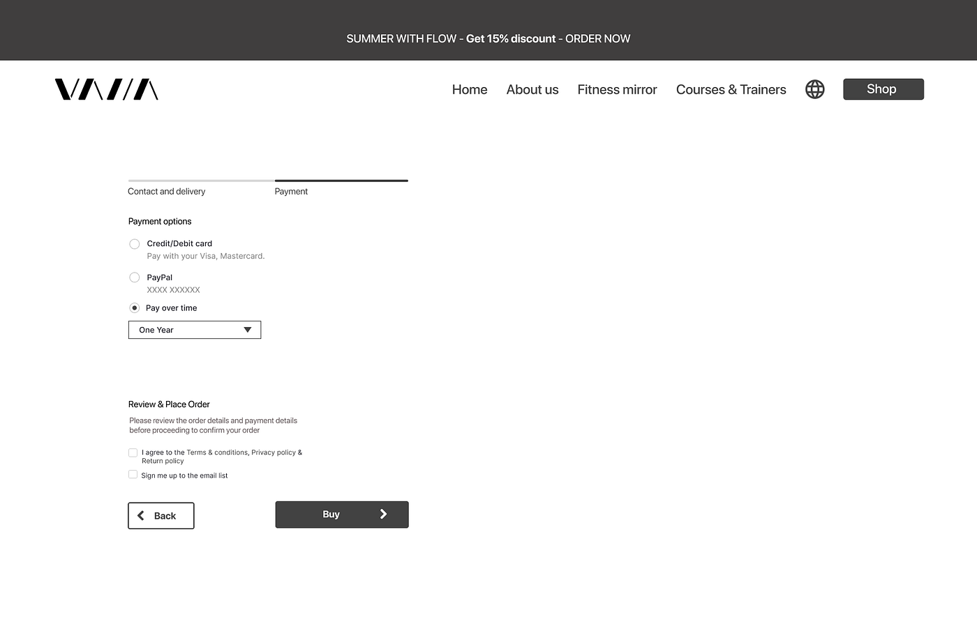
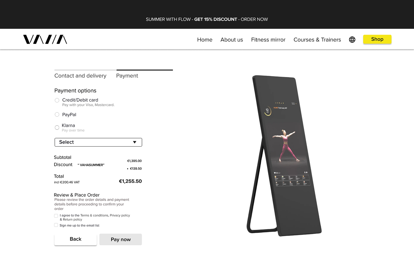
So he needs to choose between Klarna, Paypal or credit/ debit card,
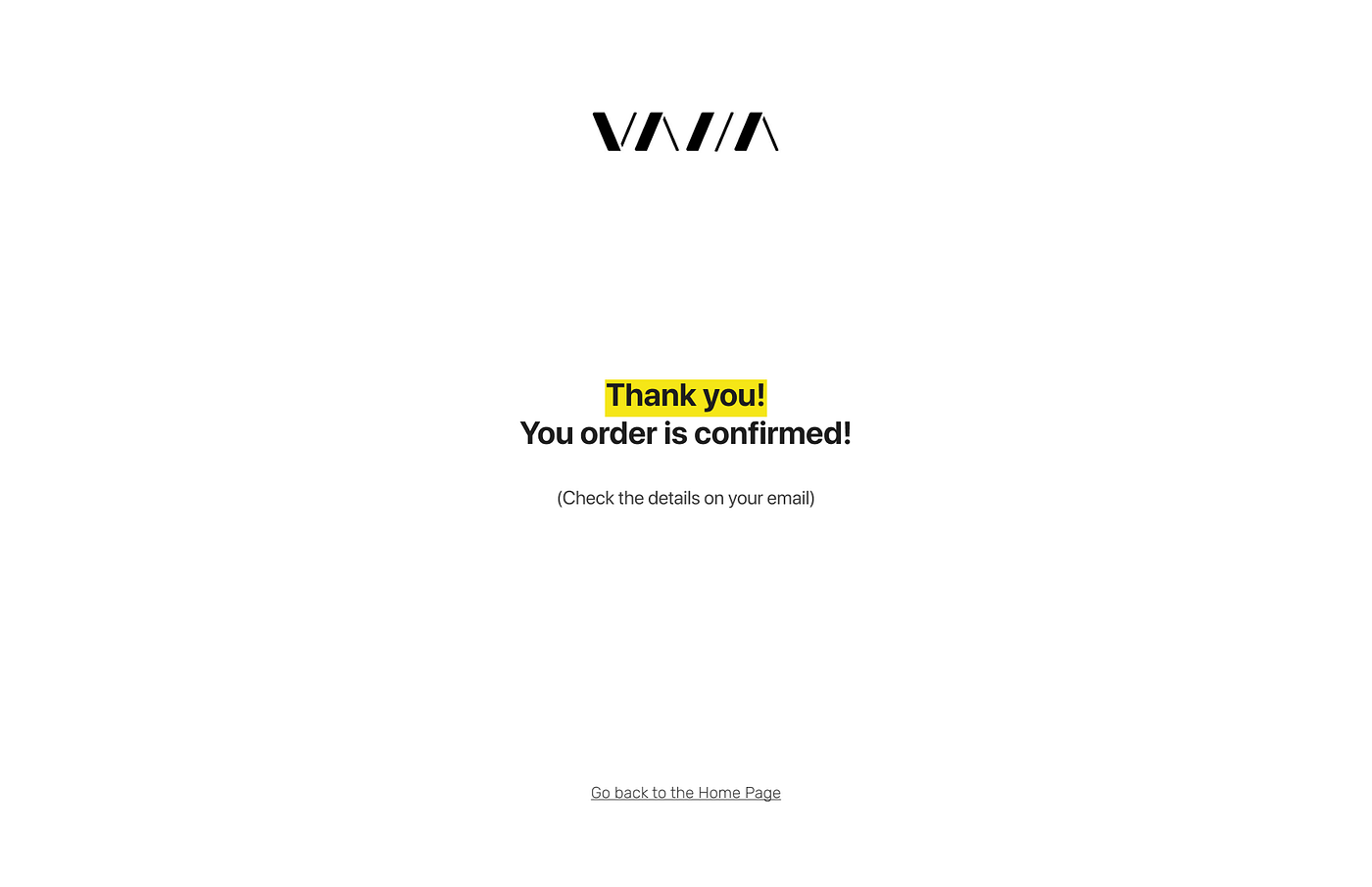
so he reaches the Thank you page and gets to the end.
Low fidelity wireframes:
After validating this first step, we went to mid fidelity wireframes:
In the next step we worked with our brand attribute developing a mood board, to concrete the brand we will develop, after defining 5 adjectives that fit to our clients desires.
Adjectives:
Motivating
Innovative
Elegant
Joyfull
Convinient
To make sure, our choose is taking the right way we tested this moodboard on usabilty hub.
The results were matching, but didn`t fit to the adjective joyful, so we were thinking about dropping this adjective of our mood board.
Our stakeholder gave their brand book to us, so we decided to keep the colors, as they are also matching to our moodboard.
Proxima Nova is the chosen typeface because it works very well with different devices.
With these brand attributes we started to work on our high fidelity prototype after we decided which fontface and colors will be used there.
Prasentation: