A Million Hellos! Best regards, Max (a million) – UX/UI Designer
Our client VAHA
Our client VAHA is a German company producing fitness mirrors with touchscreens and workout subscriptions, which enable you to do professional and guided fitness from your own home. As this product is new to the market they are still taking care of their brand awareness and position to bring their product in optimal marketplace.
Analysing State of art
In the beginning we started by a detailed look at the user journey map the customer is doing at the actual moment. In our opinion the state of art journey can be confusing for users because there is to much content at different places and we also detected an interrruption at the checkout process.
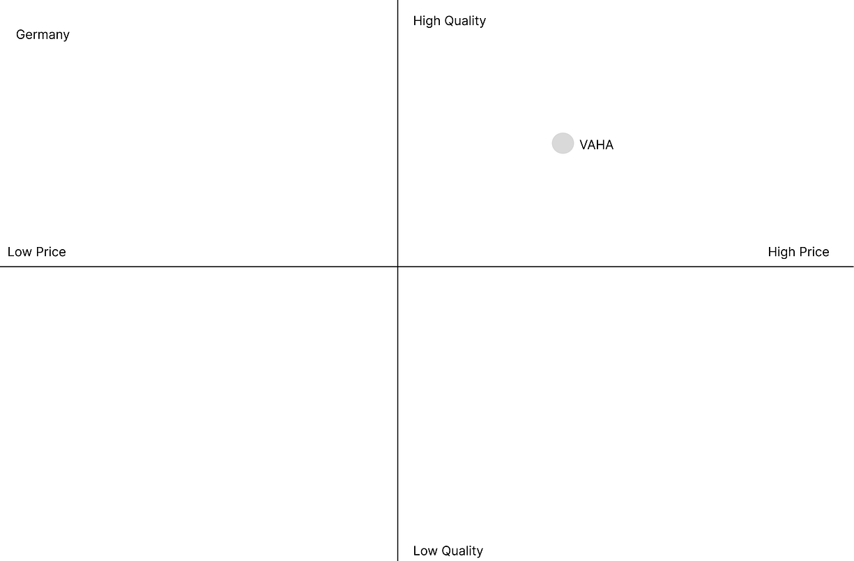
So we went further on with the competetive analysis, to get more informations about our customer and its positoning in the market by comparing with competitors.
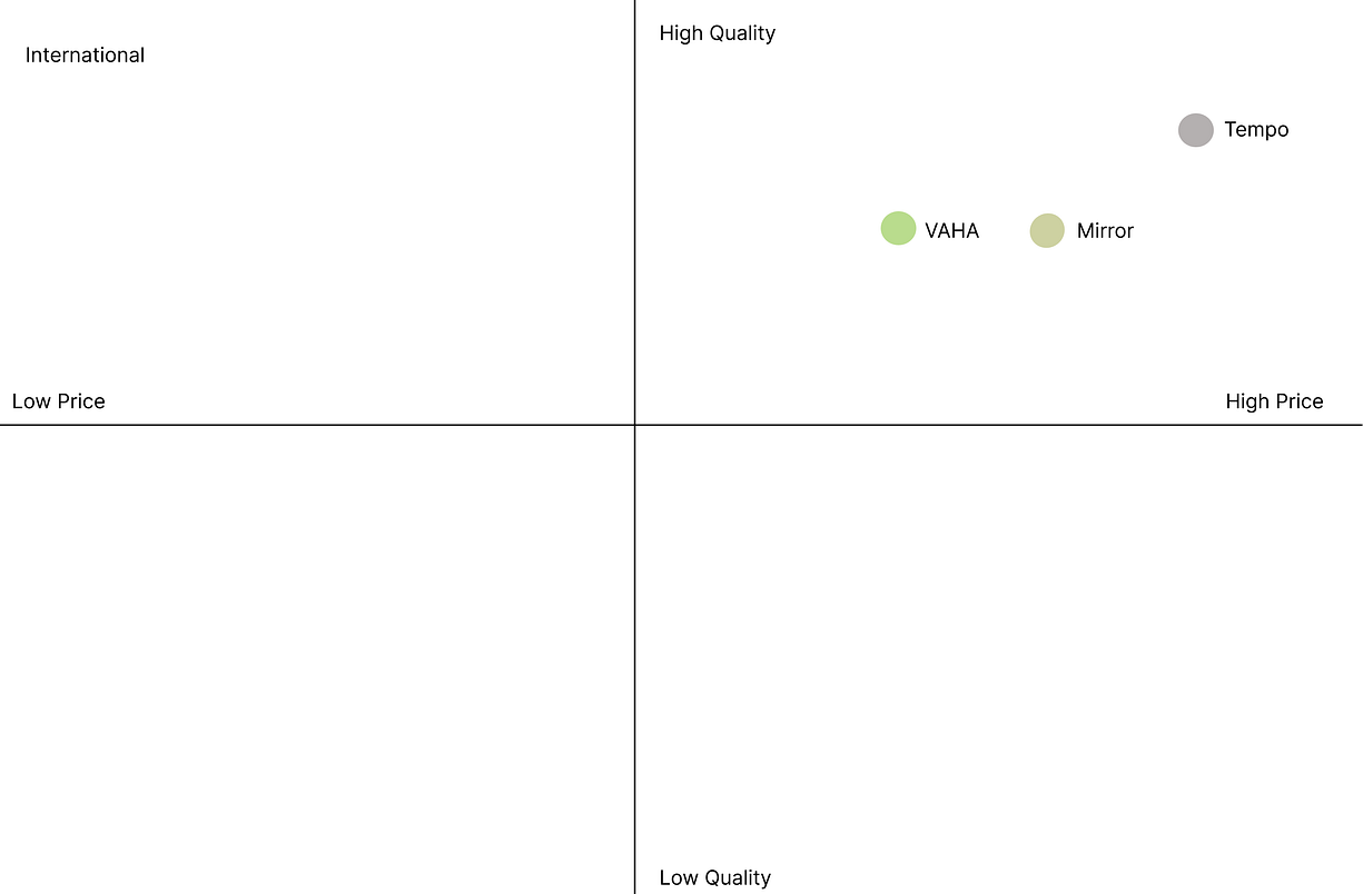
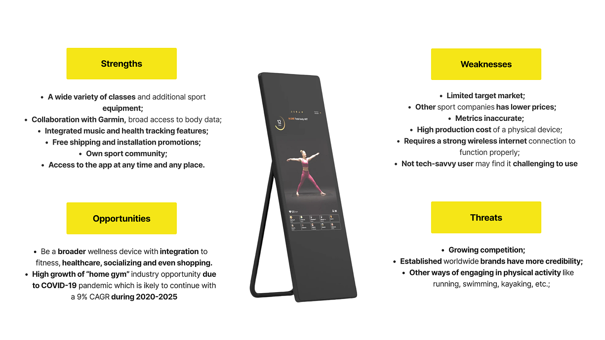
Feature comparison and SWOT analysis
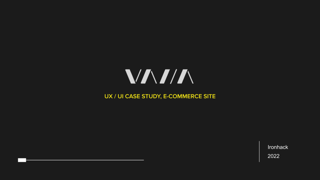
At that moment VAHA was the only one in the German market, so we took on comprehensive with the international competitors.
We detected that the price level is quite moderate with a very good quality.
In the next steps, we compared the features of our client and the competitors.
Finally, we did the SWAT (strengths, weaknesses, opportunities, and threats) for our product.
To get an overview of our actual project we started with an interview with our stakeholders, to get to know about the targets we should follow and to gather the experience he already had.
Further on we shared our experience with a state-of-the-art journey map and wanted to know, which information is essential at which point.
As the website was just growing by itself, a lot of information could be reachable and a lot more userfriendly but the graphic style should be consistent because of the brand awareness.
After finishing this required information we started with our interviews with 3 potential users about their backgrounds and motivations.
Last but not least we also did an interview with an actual customer to get our pieces of information.
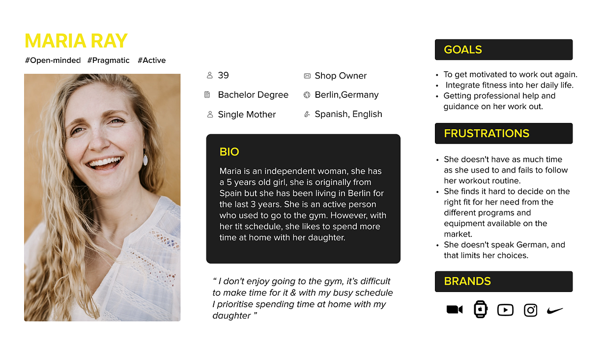
User persona Maria Ray:
With all this case information we started to build our user persona Maria Ray, which is a 39-year-old mother from Spain, living in Berlin for 3 years. She is an active woman, who likes to find work-life balance and so she likes to do sports.
But time always fails because she has her own independent shop and loves to spend time with her daughter.
So she was setting the goal to get more motivated for workouts again and to integrate fitness into her daily life. Further on she wants to get professional help and guidance.
Frustrated by the lack of time, failing with her workout routine, and the language barrier, she is looking for a solution.
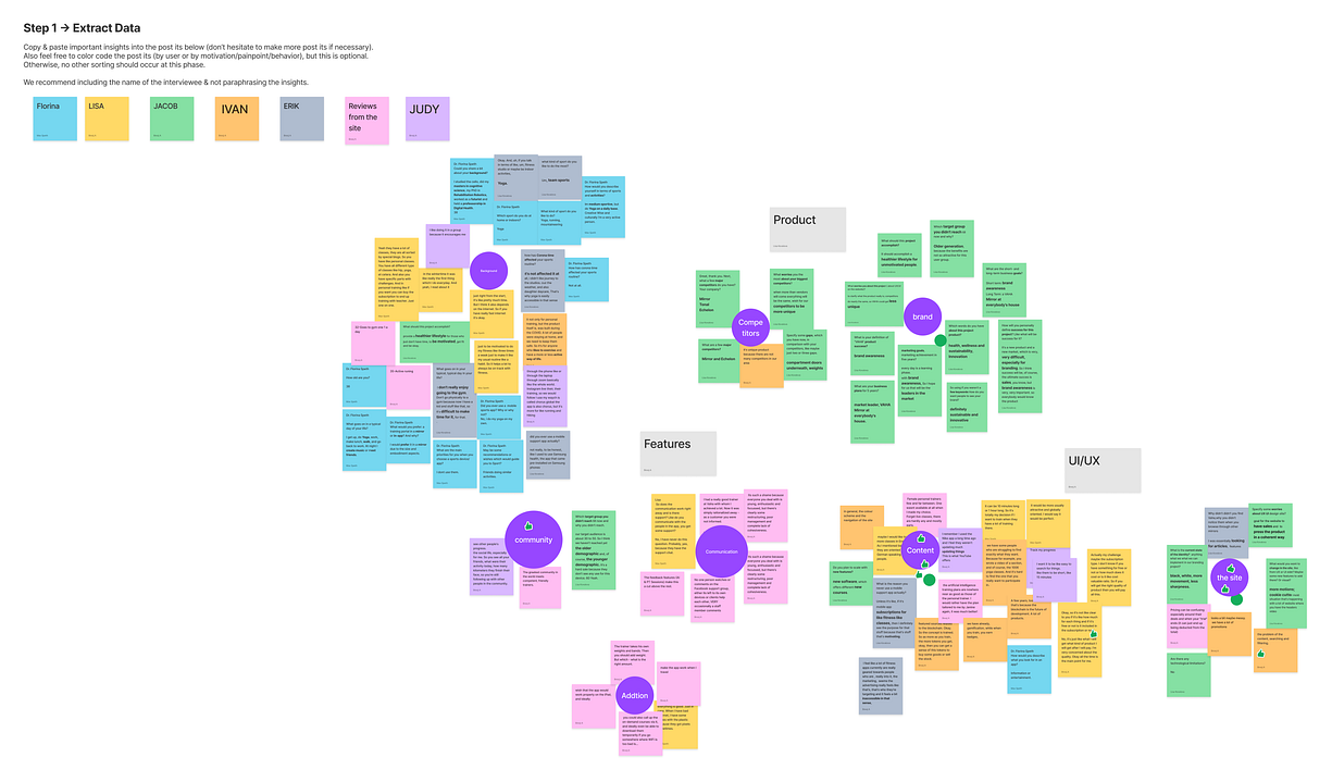
Extracting and analyzing interviews
By extracting the data of these interviews we detected 7 Clusters in our affinity diagram:
So we decided via dot voting to work on the clusters “Content” and “The site” and worked on our problem statement.
Content
The site
Brand
Competitors
Communication
Community
Addition
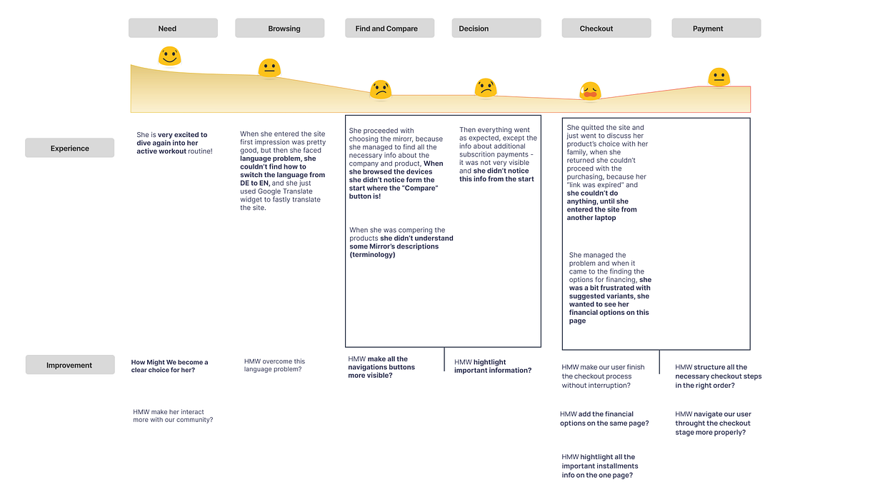
User journey map:
In the first point, we took a look at the user’s needs.
In our case of Maria Ray
Needs
She is very excited to get back to her workout routine, so she needs to get more contact with the community.
By browsing she notices that there are barely any language switches by most competitors.
So she is proceeding by choosing the VAHA mirror but by going further on by comparison of the models she does not really understand the description of the two products.
In the next step, everything went excepted but she didn`t realize the additional rescriptiment payments, so she was frustrated by not going further on to the payment button.
After a short discussion with friends and family, she went back to the shop, but her link was expired.
So she went back to her laptop realized the payment option button and was able to proceed.
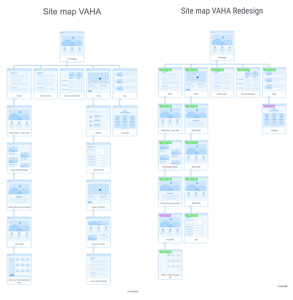
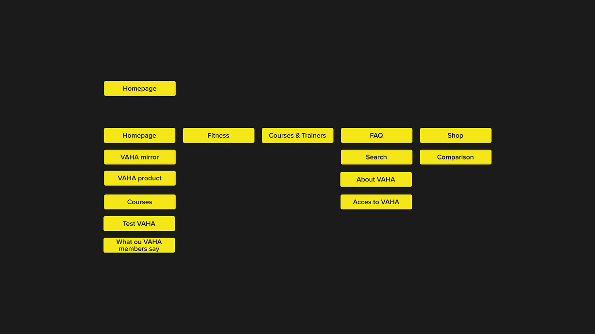
Sitemap:
At a further look at the sitemap, we realized again, that the structure and the content were just growing by the start of the business and there should be a more logical way.
So we were redesigning the sitemap to enable the user to find the needed pieces of information in a shorter and fluent way.
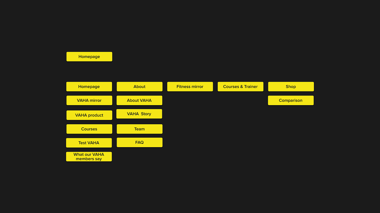
Because users might not want the content “About VAHA” and access to “Vaha” by FAQs, we added “About” to the main navigation, where you can find the “FAQs “ included. We also added “About VAHA”, “VAHA Story” and “Team”, so the user can find all information about VAHA in a short and consistent way.
State of art sitemap
Redesigned sitemap
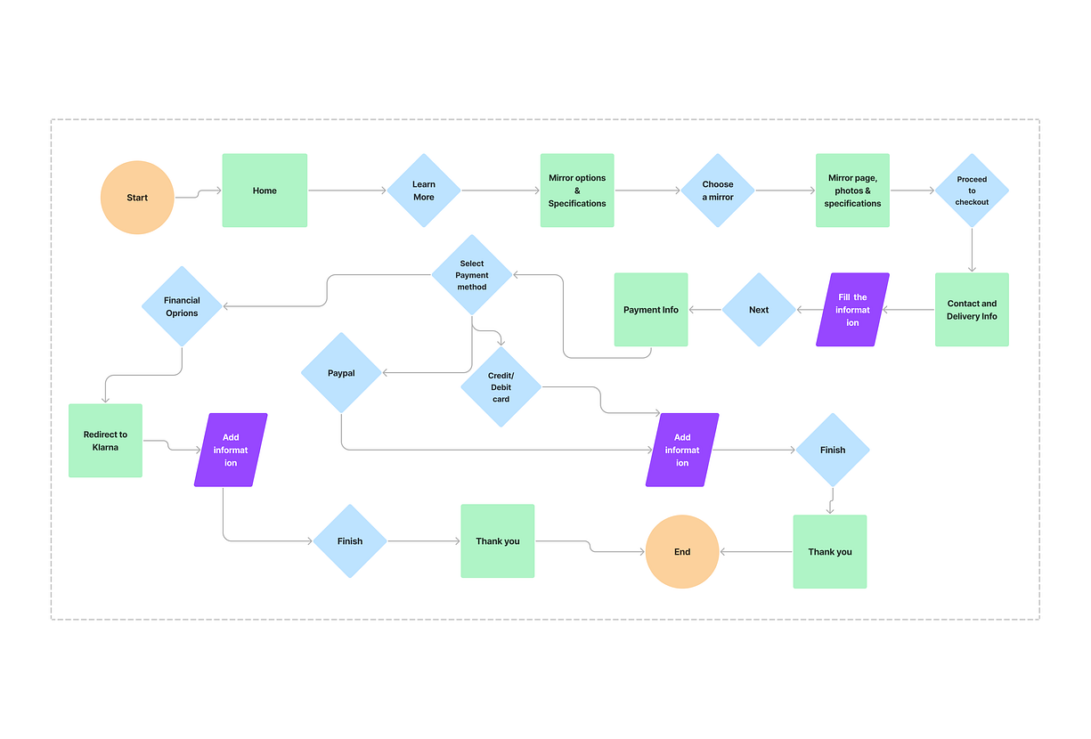
User flow
In the next step, we went on with a further look at the user flow, which is taking the customer with the new sitemap.
Now the flow is taking a simple and user-friendly way and is consistent.
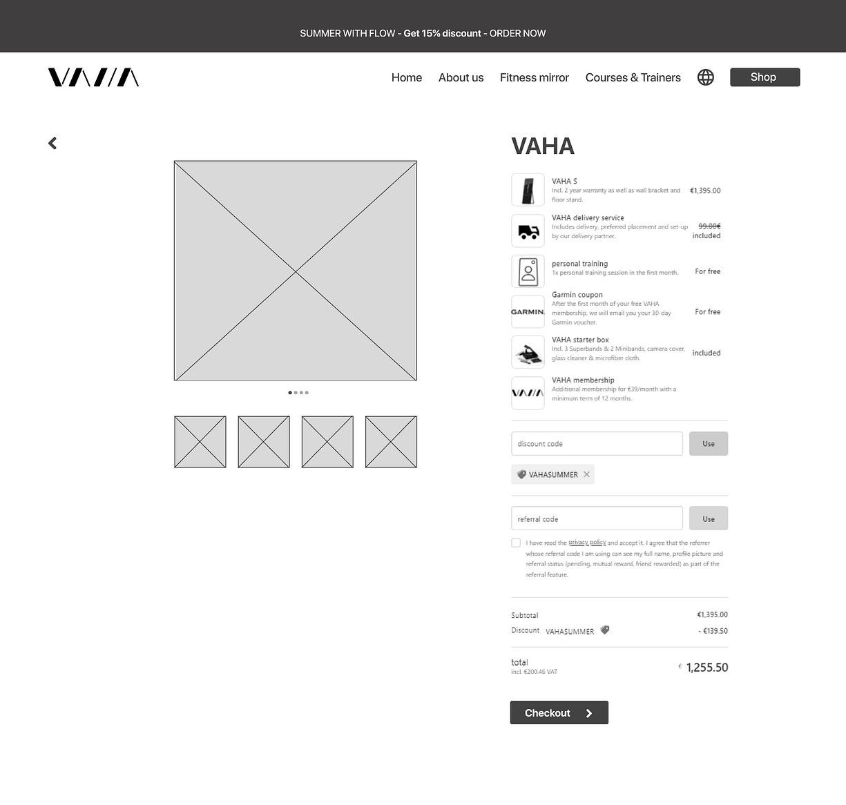
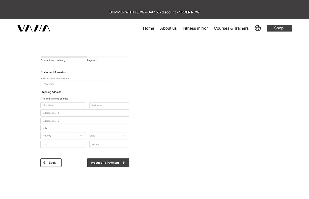
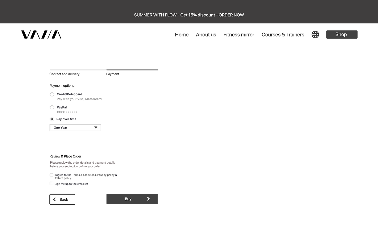
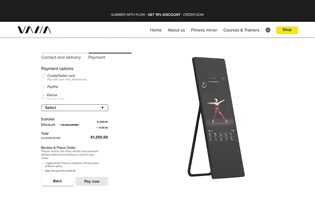
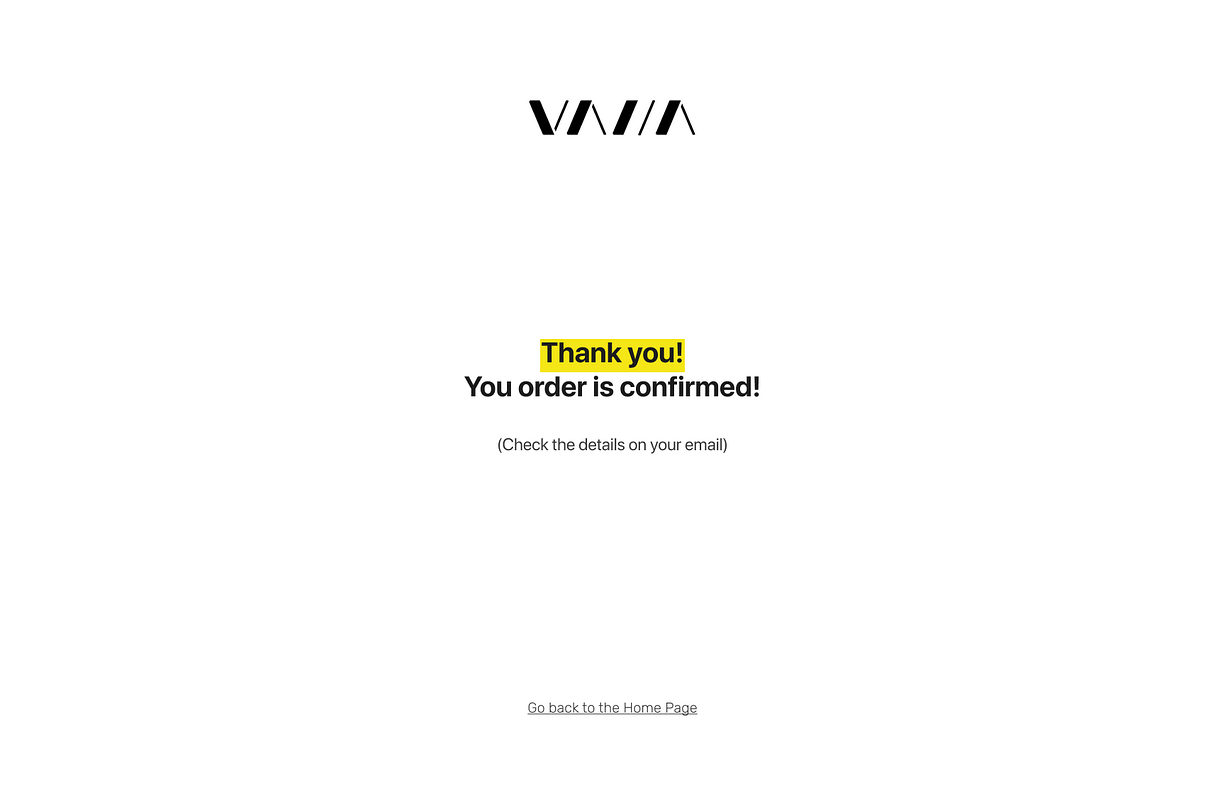
By starting with the website you get the first view, which allows you to choose the mirror options and the additional payment options, so you can easily proceed to the checkout.
Here you can find the payment options, after choosing the payment options (Klarna, PayPal, Credit & Debit card) to reach the Thank You page.
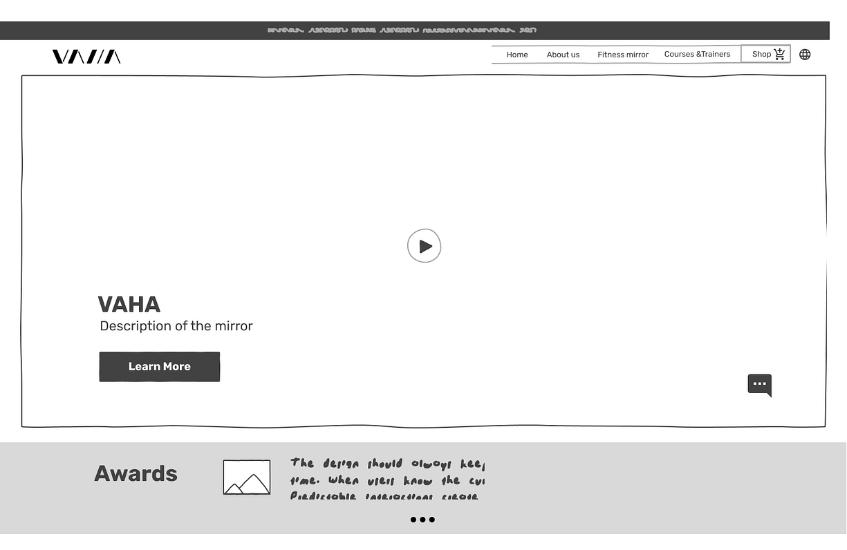
Low-fidelity wireframes:
So we went on with our Low Fidelity Wireframes to concrete the first ideas, which you can see following.
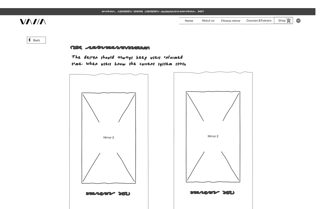
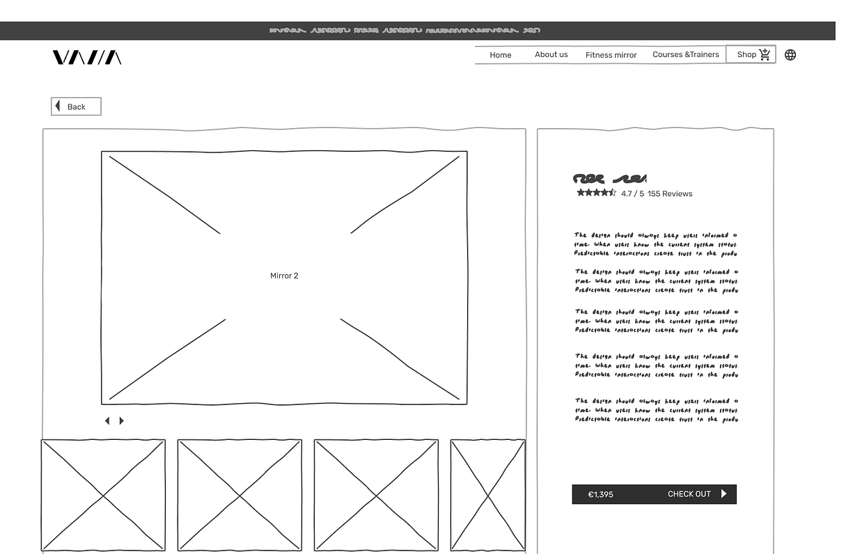
As you can see you reach an explanation of the product. In the next step, you reach the product page with the two options.
On clicking one of the offered options you reach the product detail site, which shows the options to this product with a hint to the additional payment options.
After validating this first step by user testing to validate our ideas, we went to mid-fidelity wireframes:
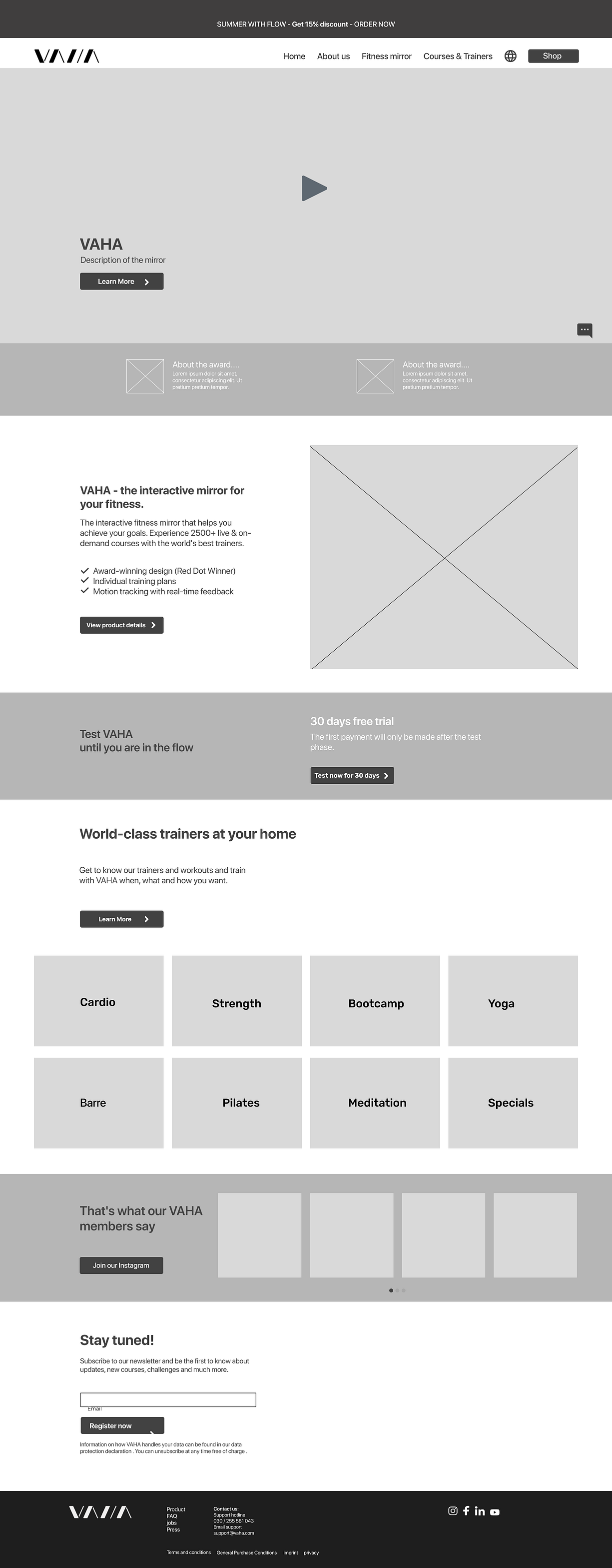
Mid Fidelity Wireframes:
After the first testing of our wireframes, we proceeded with gathering our ideas to Mid-Fidelity Wireframes.
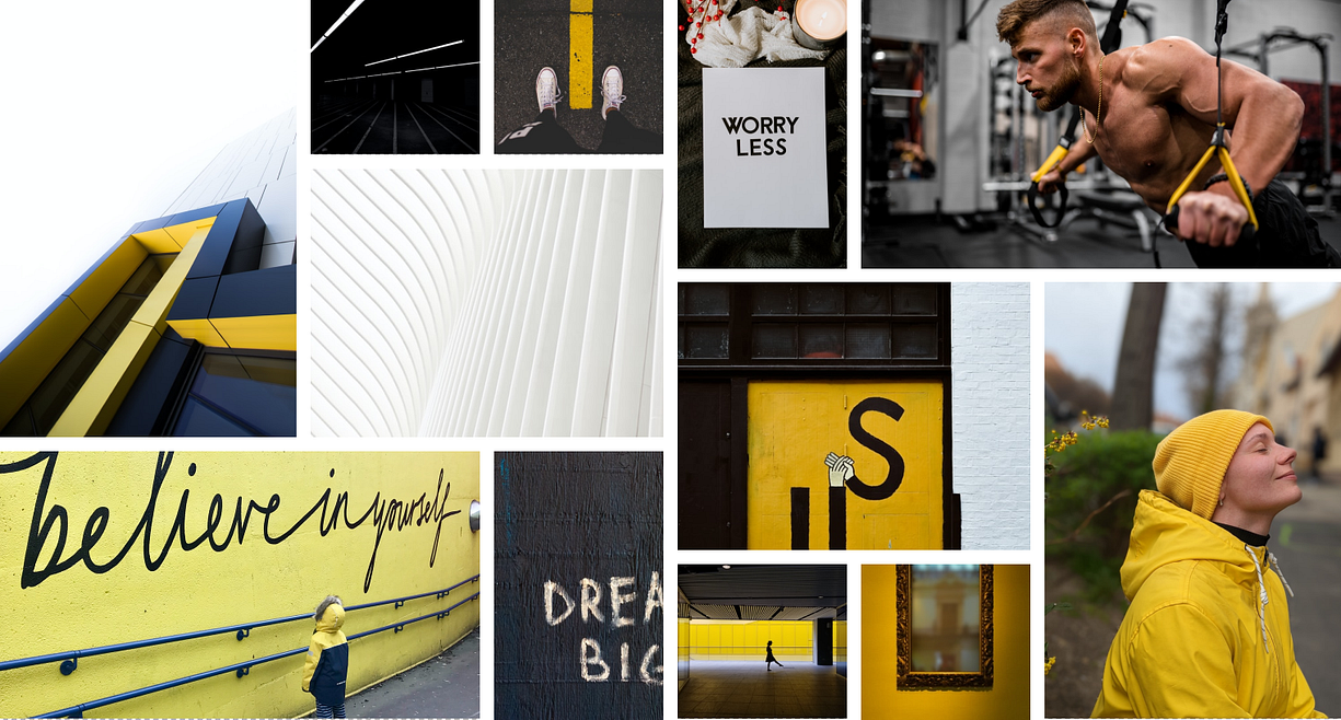
Brand Attitudes:
In the next step, we worked on our brand attribute developing a mood board, to concrete the brand we will develop after defining 5 attributes that fit our client’s desires.
You will see the targeted attributes on the right side.
Motivating
Innovative
Elegant
Joyful
Convinient
Moodboard
Because our clients wanted to keep the actual look of the appearance of their actual website, we kept colors and typography.
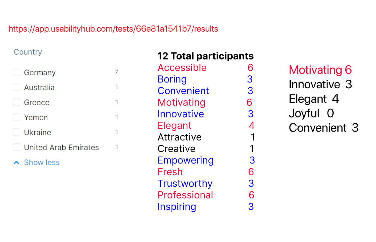
To make sure, our choice is taken the right way we tested this mood board on the usability hub.
The results matched but didn`t fit the adjective joyful, so we were thinking about dropping this adjective from our mood board.
Our stakeholder gave their brand book to us, so we decided to keep the colors, as they are also matching to our moodboard.
Typeface:
Proxima Nova is the chosen typeface because it works very well with different devices.
With these brand attributes, we started to work on our high-fidelity prototype after we decided which fontface and colors would be used there.
High Fidelity Prototype and Wireframes
At last, we went on to develop our High Fidelity Frames, to concrete our ideas,